The Checkbox Field in HT Contact Forms allows users to select one or multiple options from a list.
It’s perfect for creating multi-choice questions, consent forms, or selecting multiple categories.
Checkbox Field Settings:
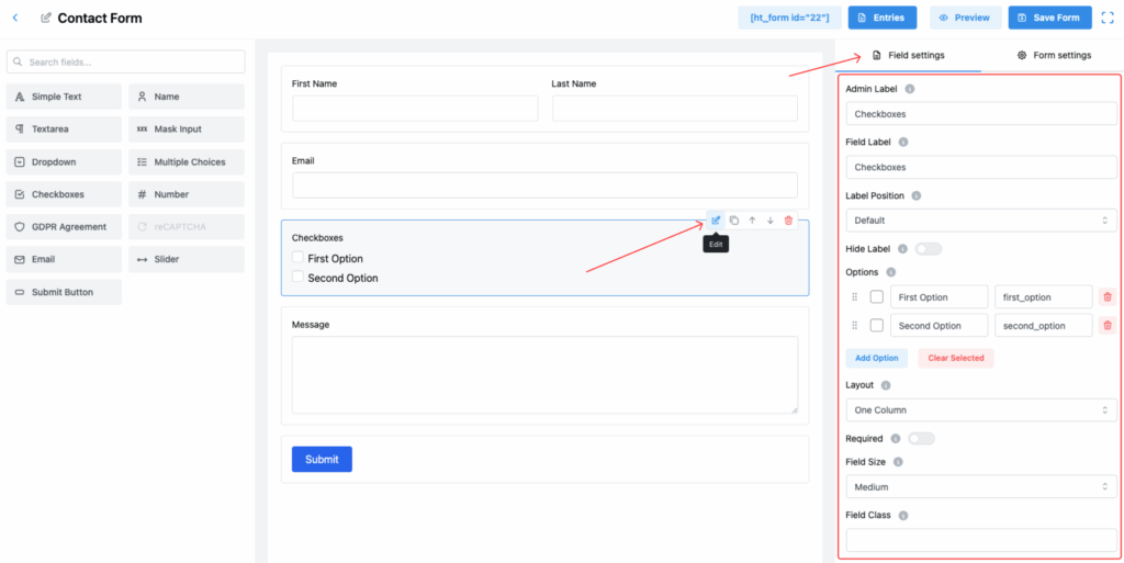
1. Admin Label
The label used internally for easier management of form fields and entries in the admin dashboard.
2. Field Label
This is the visible label users will see on the form, guiding them to make multiple selections if needed.
3. Label Position
Define where the label appears relative to the checkbox options. Available positions:
- Default
- Top
- Right
- Bottom
- Left
Select based on your form layout preference.
4. Hide Label
Toggle this option to hide the field label from the front-end view.
✅ Useful for simple layouts relying only on options.
5. Options
Create and manage multiple checkbox options:
- Add as many options as needed.
- Edit option labels and values.
- Reorder the options by dragging.
- Delete any unwanted options.
✅ Example:
- First Option (
first_option) - Second Option (
second_option)
6. Layout
Control how the checkboxes are arranged:
- One Column – Displays all fields in a single vertical column.
- Two Columns – Splits form fields into two side-by-side columns.
- Three Columns – Displays form fields in three equal-width columns.
- Four Columns – Arranges form fields into four columns, best for short input fields.
- Inline Layout – Places fields inline, useful for short and compact forms (e.g., name + email in a row).
- Button Type Layout – Optimized layout when form actions are button-centric.
✅ Helps you make forms more compact or wide depending on the design.
7. Required
Enable this toggle if at least one checkbox must be selected before submitting the form.
8. Field Size
Choose the overall size of the checkbox field area:
- Small
- Medium (Default)
- Large
This affects the spacing around the options.
9. Field Class
Specify a custom CSS class for the checkbox field for applying custom styles via CSS.
10. Help Message
Provide additional instructions or information for users about the field.
✅ Useful to clarify rules like “Select at least two options.”
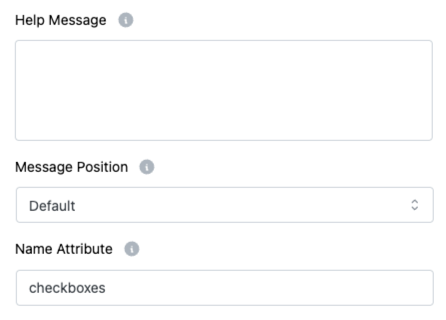
11. Message Position
Choose where the Help Message appears:
- Default
- Next to Label as Tooltip
- Below Input Element
Improves form usability and accessibility.
12. Name Attribute
Set a unique name attribute for the checkbox field.
✅ Important for identifying the selected values when processing form submissions.
Important Note:
📌 Max Text Length is not applicable for checkboxes, because users select from predefined options instead of typing input.
Tip:
Use the Two Column or Three Column layout if you have many options. It helps make the form more compact and improves user experience! ✅ ✅ ✅