The Country List field allows users to select their country from a dropdown list.
It’s ideal for collecting location-specific data and supports features like auto-detection, filtering based on visibility rules, and more. This field is especially useful in scenarios such as event registrations, shipping forms, and any form that requires country-specific handling.
Country List Field Settings:
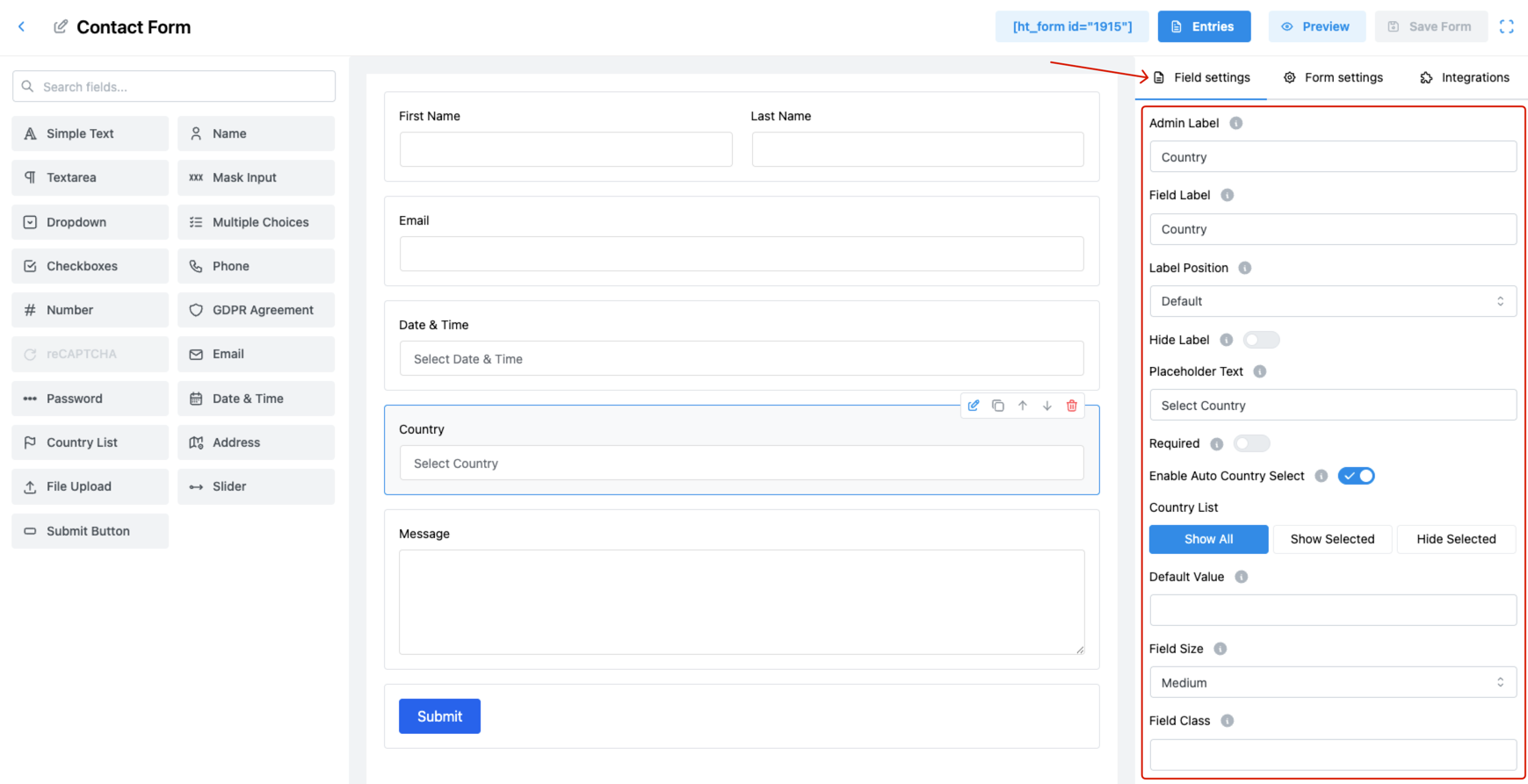
1. Admin Label
Set an internal name for the field.
🗂️ Used only within the admin panel to identify the field in submissions.
2. Field Label
Define the label that users will see on the front-end form.
✅ This helps users know they should select their country from the dropdown.
3. Label Position
Choose where the label appears relative to the field:
- Default
- Top
- Right
- Bottom
- Left
📌 Positioning helps maintain form layout consistency.
4. Hide Label
Toggle ON to hide the label from users.
✅ Useful for compact layouts where the placeholder provides sufficient context.
5. Placeholder Text
Provide hint text inside the dropdown when no selection has been made.
💡 Example: Select Country
6. Required
Enable this option to make country selection mandatory.
✅ Prevents form submission without a valid country choice.
7. Enable Auto Country Select
This option uses the user’s IP address to automatically pre-select their country.
🌐 Enhances user convenience by reducing manual effort.
8. Country List
Control which countries are visible in the dropdown:
- Show All: Displays the full list of countries.
- Show Selected: Displays only the countries you manually select.
- Hide Selected: Hides specific countries while showing the rest.
🛠️ This feature is perfect for region-specific forms or limiting to serviceable areas.
9. Default Value
Set a country that will be pre-selected when the form loads.
🌍 Ideal if your audience is mostly from one country.
10. Field Size
Adjust how big the country dropdown appears:
- Small
- Medium (Default)
- Large
🎨 Choose a size that fits your form’s layout.
11. Field Class
Insert a CSS class to apply custom styles.
🎨 Great for advanced developers who want to override default styling.
12. Help Message
Add helpful tips or instructions to guide the user.
✅ Example: “Please select your country of residence.”
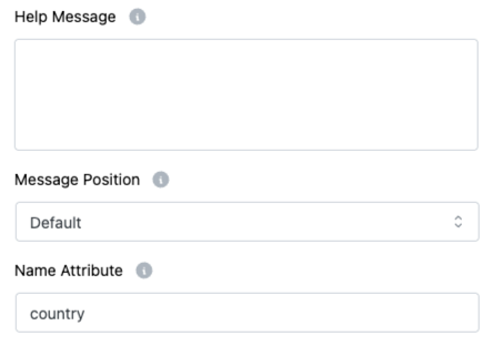
13. Message Position
Choose where to place the help messages:
- Default
- Next to Label as Tooltip
- Below Input Element
🎯 Helps users by displaying help or info messages in the most appropriate position for better clarity and usability.
14. Name Attribute
Assign the name attribute for backend reference.
👉 Essential for retrieving the selected country in form data.
Pro Tips:
- Use Auto Country Select for faster user interaction.
- Hide or show specific countries to tailor the form to your business region.
- Combine placeholder, help message, and required for a complete user experience.