Overview
The Color Picker Field allows users to select a color using a native browser color selector. It is useful for collecting brand colors, design preferences, or any color-based input in your contact forms.
The selected color is stored as a HEX value and can be used in form entries, email notifications, and exports.
How to Add the Color Picker Field
- Go to HT Contact Form → Forms
- Open an existing form or create a new one
- From the field list, drag Color Picker into your form
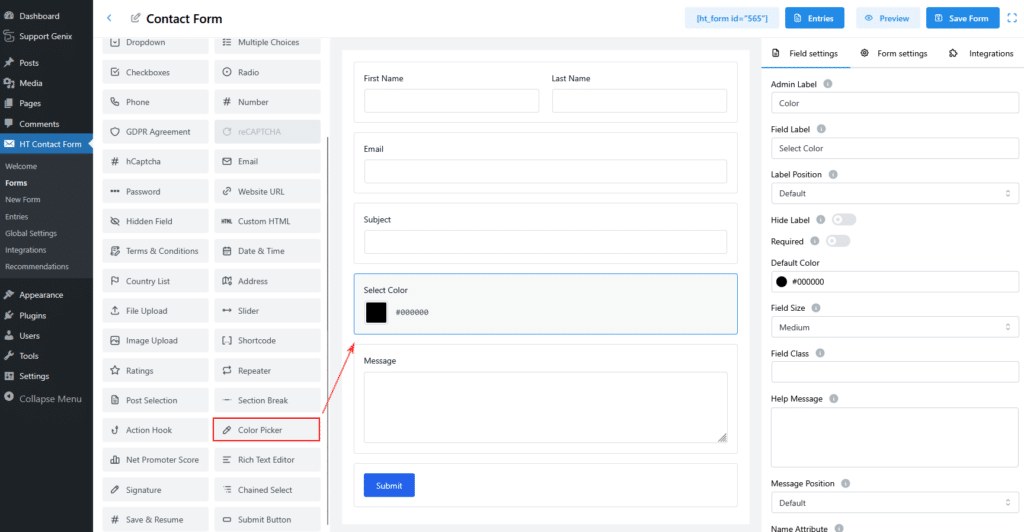
The color picker will appear in the form preview with a color box and HEX value.
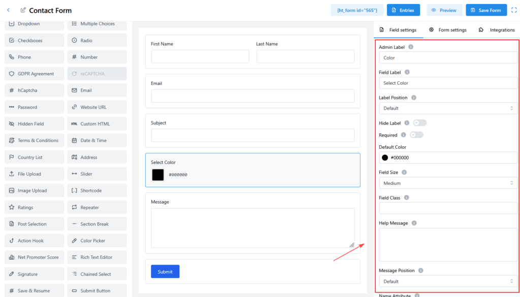
Field Settings
Admin Label
- Used only for internal identification
- Not visible on the frontend
- Example:
Color
Field Label
- Displayed on the frontend form
- Helps users understand what the color is for
- Example:
Select Color
Label Position
Controls where the label appears.
Available options:
- Default
- Top
- Left
- Right
- Bottom
Hide Label
- Enable to hide the field label from the frontend
- Useful when the purpose is already clear from context
Required
- Enable to make color selection mandatory
- Users must submit a color value to submit the form
Default Color
- Sets the pre-selected color when the form loads
- Uses HEX format
- Example:
#000000
This value is automatically selected unless the user changes it.
Field Size
Controls the visual size of the color picker.
Available options:
- Small
- Medium (default)
- Large
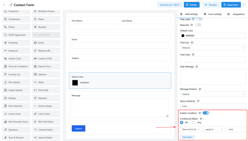
Field Class
- Add a custom CSS class for styling
- Useful for advanced design customization
Example:
custom-color-field
Help Message
- Displays helper text below the field
- Used to guide users on what color to select
Example:
Please select your preferred color
Message Position
Controls where the help message appears.
Options:
- Default
- Above Field
- Below Field
Name Attribute
- HTML name attribute for the field
- Used in submissions and integrations
Example:
color
Conditional Logic
The Color Picker Field supports conditional display.
Enable Condition
- Toggle Enable Condition to activate logic rules
Conditional Match
- All – all conditions must match
- Any – at least one condition must match
You can show or hide the Color Picker field based on values from other fields.
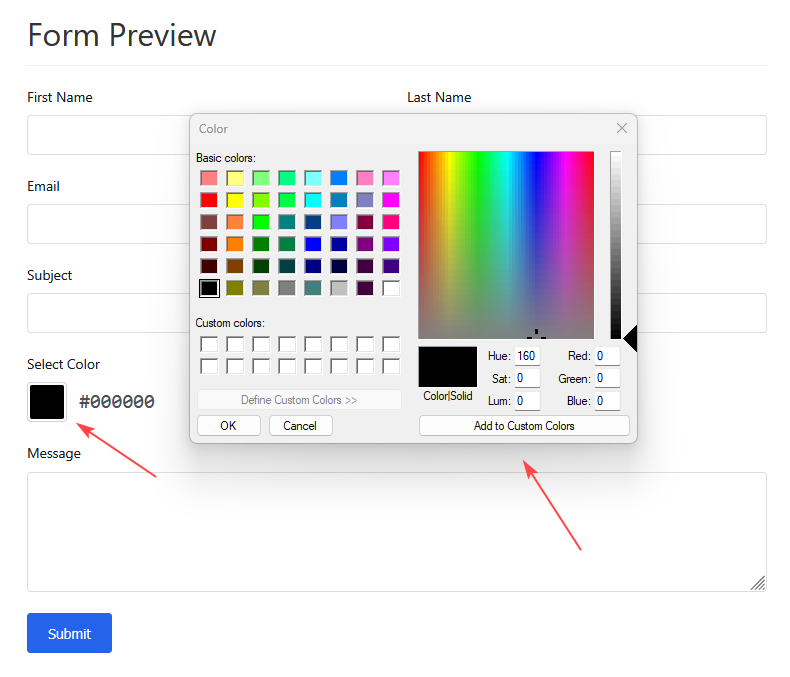
Frontend Display
On the frontend, users will see:
- A clickable color box
- The selected HEX color value
Example:
#000000
Viewing Submitted Data
Form Entries
- Color is displayed as a HEX value
- A color preview is shown in entry details
Email Notifications
- Color value is sent as text
- Use the field smart tag in email templates
Example output:
Selected Color: #000000
Exported Data
- Exported as HEX color values
- Compatible with CSV and Excel formats
Save & Resume Support
The Color Picker Field fully supports Save & Resume:
- Selected color is saved with the draft
- Restored automatically when users resume the form
Browser Compatibility
The Color Picker Field works in all modern browsers, including:
- Chrome
- Firefox
- Safari
- Edge
The picker interface may vary by browser, but the output format remains the same.
Data Format
- Stored as a 6-digit HEX color code
- Always includes the
#prefix
Example:
#3498DB
Best Practices
- Set a meaningful default color
- Use help messages for clarity
- Group multiple color fields together if needed
- Avoid relying only on color to convey important information
Conclusion
The Color Picker Field provides a simple, reliable way to collect color values in your forms. It integrates smoothly with entries, emails, exports, and conditional logic while maintaining a clean user experience.