The Date & Time field allows users to select specific dates and times through a calendar and clock interface.
It’s ideal for booking forms, appointment scheduling, event registration, and any scenario where time input is needed.
Date & Time Field Settings:
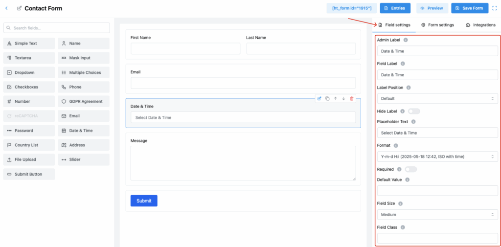
1. Admin Label
Set an internal identifier for this field.
🔒 This label is not shown to users but helps manage form entries in the backend.
2. Field Label
Define the label shown to users on the form.
✅ Clearly indicates that a date and time selection is required.
3. Label Position
Choose where to position the label relative to the field input:
- Default
- Top
- Right
- Bottom
- Left
📌 Match this with your design preferences for a cohesive layout.
4. Hide Label
Toggle ON to hide the front-end label.
✅ Ideal when using descriptive placeholder text instead of a visible label.
5. Placeholder Text
Provide guidance inside the input before user interaction.
💡 Example: Select Date & Time
6. Format
Select the desired date-time format for user input.
Examples include:
Y-m-d H:i(e.g., 2025-05-18 12:42)- Other formats may include
d-m-Y,m/d/Y, etc.
📅 Use ISO format or a familiar regional format based on your audience.
7. Required
Make this field mandatory to ensure the user selects a valid date and time.
✅ Useful for forms where scheduling is essential.
8. Default Value
Set a pre-filled value for the field (e.g., today’s date/time).
🕒 This can streamline the process for users when a typical time is expected.
9. Field Size
Control the visual size of the input box:
- Small
- Medium (Default)
- Large
🎨 Select a size that suits the rest of your form elements.
10. Field Class
Enter a CSS class for custom design control.
🎨 Useful for advanced styling and layout tweaks.
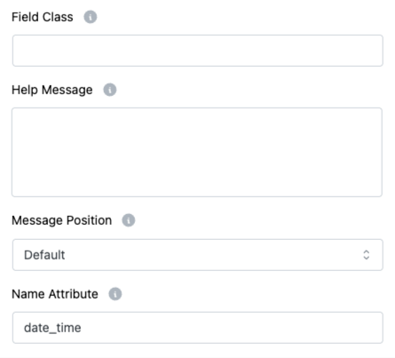
11. Help Message
Provide helpful notes or formatting instructions for users.
✅ Example: “Select a date and time between 9 AM and 5 PM.”
12. Message Position
Determine where the help or validation message is shown:
- Default
- Next to Label as Tooltip
- Below Input Element
🧭 Improves usability by placing feedback where users expect it.
13. Name Attribute
Assign a name attribute for backend submission.
👉 Used when retrieving the selected value from form data.
Pro Tips:
- Combine placeholder, help message, and required for a more intuitive experience.
- Pick a format your users are most comfortable with to avoid confusion.
- Always validate time-sensitive data on the backend for critical use cases.