The Layout section in the Global Settings of HT Contact Forms allows you to control the appearance and positioning of different form elements, making your forms more user-friendly and visually organized.
Below are the available options and their functionalities:
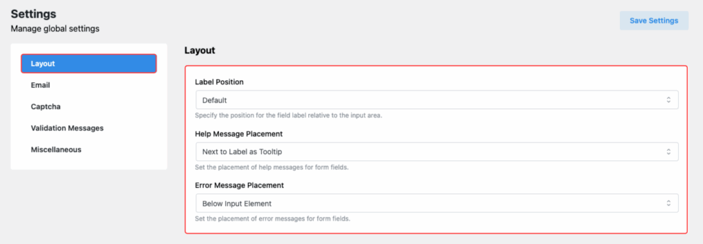
Label Position
Option Purpose:
Control where the field label will appear relative to the input field.
Available Positions:
- Default: Standard position based on the form design.
- Top: Label appears above the input field.
- Right: Label appears to the right of the input field.
- Bottom: Label appears below the input field.
- Left: Label appears to the left of the input field.
📌 Choose the position that best suits your form layout needs.
Help Message Placement
Option Purpose:
Decide where the help message (guidance text) will be shown to users.
Available Positions:
- Next to Label as Tooltip:
The help message appears as a tooltip beside the label. - Below Input Element:
The help message is displayed directly below the input field.
📌 Use tooltips for a cleaner look or display messages below fields for clearer guidance.
Error Message Placement
Option Purpose:
Set the placement for error messages when user input validation fails.
Available Positions:
- Below Label:
Error message shows below the field label. - Below Input Element:
Error message appears right under the input field.
📌 Place error messages thoughtfully to help users easily identify and correct mistakes.
✅ After setting your preferred options, don’t forget to click “Save Settings” to apply the changes globally across all forms.