The Multiple Choices Field in HT Contact Forms allows users to select one or more options from a list.
It is ideal for questions that require multiple answers, like selecting preferences, favorite items, or multi-category selection.
Multiple Choices Field Settings:
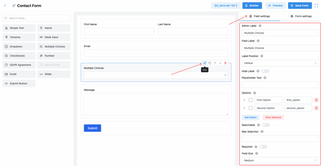
1. Admin Label
The internal label used within the form builder and admin dashboard for easy management of entries.
2. Field Label
This is the visible label users will see on the form, helping them understand what they are selecting.
3. Label Position
Choose where the field label appears relative to the selection options:
- Default
- Top
- Right
- Bottom
- Left
Select the position that best fits your form layout.
4. Hide Label
Toggle this switch to hide the label from users on the front-end.
5. Placeholder Text
(Optional) You can provide placeholder text that appears before the user selects an option.
✅ Useful for offering guidance like “Select your preferences.”
6. Options
Create and manage the list of available choices:
- Add multiple options.
- Set both the Label (visible text) and the Value (internal value) for each option.
- Rearrange options easily by dragging.
- Delete any unwanted options.
✅ Example:
- First Option (
first_option) - Second Option (
second_option)
7. Searchable
Enable this feature to allow users to quickly search for options within the list.
✅ Highly recommended if you have many options.
8. Max Selection
Set the maximum number of options a user can select.
✅ Example: If set to 2, the user can only pick two choices.
9. Required
Enable this toggle to make selection mandatory before the user can submit the form.
10. Field Size
Select the size of the field according to your form design. Options:
- Small
- Medium (Default)
- Large
11. Field Class
Assign a custom CSS class for the field for styling it uniquely through additional CSS rules.
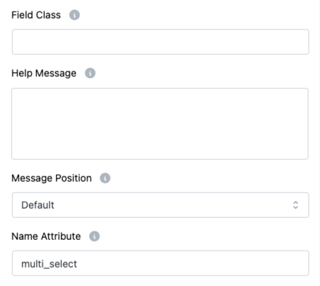
12. Help Message
Provide extra instructions or information about the field.
✅ Example: “You can select up to 3 options.”
13. Message Position
Specify where the Help Message should appear relative to the field:
- Default
- Next to Label as Tooltip
- Below Input Element
Choose the best option to enhance clarity.
14. Name Attribute
Set a unique name attribute for the multiple choices field.
✅ Essential for properly processing the submitted form data.
Important Note:
📌 Max Text Length does not apply to the Multiple Choices field, since users select predefined options, not type manually.
Tip:
If you expect users to select multiple preferences but want to limit it, always configure the Max Selection field to control user input efficiently! 🎯