The Name input field in HT Contact Forms gives you flexibility to customize how users enter their names.
You can configure different settings to match your form design and data collection needs.
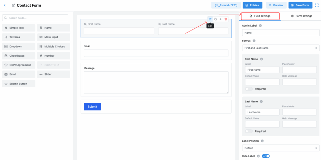
Name Field Settings:
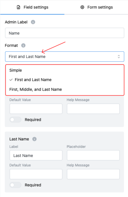
1. Format
Choose the format for collecting names. Two options are available:
- Simple
- First and Last Name (Default)
- First, Middle, and Last Name
👉 When you select First, Middle, and Last Name, an additional input field for Middle Name will appear.
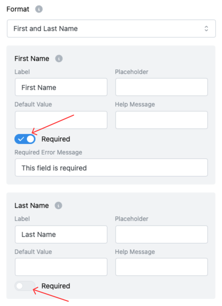
2. Required Toggle
Make any part of the name field required.
✅ If enabled, users must fill out the field before submitting the form.
❌ If disabled, users can submit the form without filling that field.
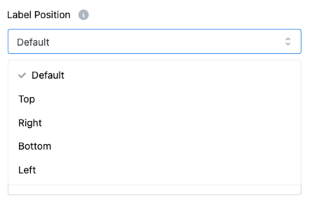
3. Label Position
Control where the label appears relative to the input box. You can choose from:
- Default
- Top
- Right
- Bottom
- Left
This gives you flexibility for different form layouts.
4. Hide Label
Enable this option to completely hide the field label.
Useful when you want a cleaner, minimalistic design.
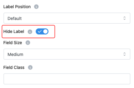
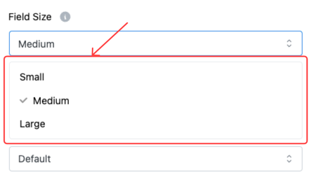
5. Field Size
Select the size of the input field to match your form’s layout. Options:
- Small
- Medium (Default)
- Large
Choose the size that fits your form’s design best.
6. Field Class
Add a custom CSS class to the field.
🎨 This allows you to apply additional styles and tailor the field appearance through custom CSS.
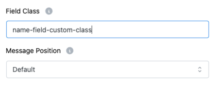
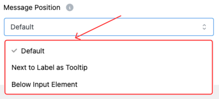
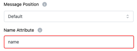
7. Message Position
Control where the Help Message will appear:
- Default
- Next to Label as Tooltip
- Below Input Element
This option helps you improve form usability based on your design preference.
8. Name Attribute
Set a unique name attribute for the input field.
👉 This attribute is used during form submission to identify the field values in the database or emails.
Tip:
Configuring the Name field properly not only improves your form’s look and feel but also ensures cleaner data collection and better user experience! 🌟