The Number Input field in HT Contact Forms is used to collect numeric values, such as quantities, prices, percentages, or any other number-based data.
It includes flexible settings to control validation, limits, and styling.
Number Input Field Settings:
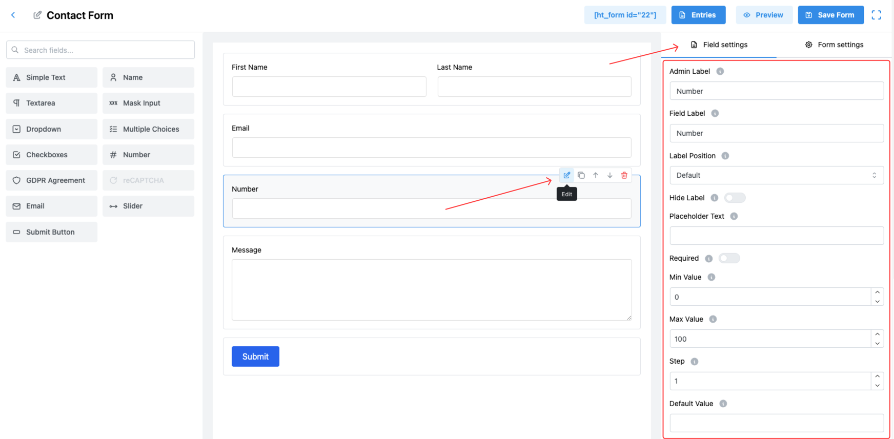
1. Admin Label
Set the label that appears internally in the form builder and admin panel.
✅ Useful for identifying the field easily when managing form entries.
2. Field Label
This is the label users will see when filling out the form, indicating that a number should be entered.
3. Label Position
Control where the label appears relative to the number input field. Options:
- Default
- Top
- Right
- Bottom
- Left
Adjust based on your form’s design for better UX.
4. Hide Label
Enable this option to hide the label from front-end users, creating a more minimal design.
5. Placeholder Text
Provide a hint inside the input box, visible when the field is empty.
✅ Example: “Enter quantity”.
6. Required
Enable this toggle to make the field mandatory for form submission.
✅ Ensures users cannot submit the form without entering a number.
7. Minimum Value (Min Value)
Set the minimum numeric value users are allowed to input.
✅ Example: Setting it to 0 ensures no negative numbers are entered.
8. Maximum Value (Max Value)
Define the maximum numeric value users can enter.
✅ Example: Limit quantity entries between 1 and 100.
9. Step
Specify the step interval between acceptable numbers.
✅ Example: If Step is set to 5, users can input 5, 10, 15, etc.
✅ Useful for fields like Age (step 1) or Product Quantities (step 1, 5, 10).
10. Default Value
Pre-fill the field with a number when the form loads.
✅ Example: Default quantity of 1.
11. Field Size
Select the size of the input field to match your form’s layout. Options:
- Small
- Medium (Default)
- Large
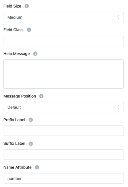
12. Field Class
Assign a custom CSS class for the field to customize its appearance through additional styling.
13. Help Message
Provide additional instructions, tips, or warnings related to the number field.
✅ This helps users understand the input expectations.
14. Message Position
Control where the Help Message will appear:
- Default
- Next to Label as Tooltip
- Below Input Element
Choose the placement that best fits your design needs.
15. Prefix Label
Add a prefix text before the input box.
✅ Example: $ symbol for price input.
16. Suffix Label
Add a suffix text after the input box.
✅ Example: % symbol for percentage input.
17. Name Attribute
Set a unique name attribute for the number input field, necessary for identifying the field during form submission and backend processing.
Note:
📌 Max Text Length is NOT available specifically for number fields in the same way as text fields. Instead, you control the acceptable range using Min Value and Max Value settings.
Tip:
Always define Minimum, Maximum, and Step values carefully to guide users and collect the correct type of numeric input! 🔢