15+ Best Email Pop-up Examples & Tips That Actually Convert

The best email popups combine 4 elements: a clear value proposition (discount, exclusive content, or utility), strategic timing (exit-intent or scroll-based), mobile-responsive design, and minimal friction (1–2 form fields max).
Top-performing email popups convert at 15–25%, far above the average popup conversion rate of 4.82%. This guide showcases 15+ real examples from brands like Dolce & Gabbana, Brooklinen, Tommy Hilfiger, Blume, and Nature’s Fynd, plus 10 actionable design tips to boost your own pop-up conversions.
Quick Answer: The best email pop-up examples share these traits: compelling headlines that promise value, incentives (10–20% discounts or free content), simple designs with 1–2 form fields, mobile optimization, and smart triggers (exit-intent, scroll depth, or time delay). Brands like Brooklinen, Blume, and Dolce & Gabbana achieve above-average conversion rates by combining these elements. Browse 15+ real examples below for design inspiration.
Ever landed on a website and been greeted by a beautifully designed pop-up offering 15% off your first order? Or seen a clever exit-intent pop-up that made you reconsider leaving? The best email pop-ups don’t feel annoying — they feel valuable.
Email popups remain one of the highest-converting tools for growing your subscriber list. The average pop-up converts at 4.82%, but the top 10% of campaigns hit 57.7%, and exit-intent pop-ups convert 15–25% of abandoning visitors. This post will show you 15+ real email pop-up examples from recognizable brands and 10 proven design tips you can apply today.
If you’re new to pop-up builders, start with our guide: What Are Pop-Up Builders? A Complete WordPress Guide.
Table of Contents
Why Do Email Popup Examples Matter for Your Website?
Studying real-world email pop-up examples helps you understand what works before you build your own. You can borrow proven design patterns, copy frameworks, and incentive structures that top brands have already tested — saving you weeks of A/B testing from scratch.
The data backs this up: while the average email popup converts at 4.82%, pop-ups with discounts convert at 7.45% — a 62% improvement. Even the number of form fields matters: single-field pop-ups convert at 4.87%, while three-field forms achieve 7.86%. These are the kinds of insights you can only pick up by studying what others are doing.
The examples below come from eCommerce brands, DTC companies, B2B platforms, and content publishers, so you’ll find relevant inspiration regardless of your niche.
ShopLentor – WooCommerce Builder for Elementor & Gutenberg
A versatile page builder to build modern and excellent online stores with more than 100k Active Installations.
15+ Real Email Popup Examples from Top Brands
Below are 15 email popup examples from real brands across eCommerce, SaaS, B2B, and media. Each example includes what makes it effective — so you can apply the same techniques to your own popups.
1. Dolce & Gabbana – Luxury Minimal Popup
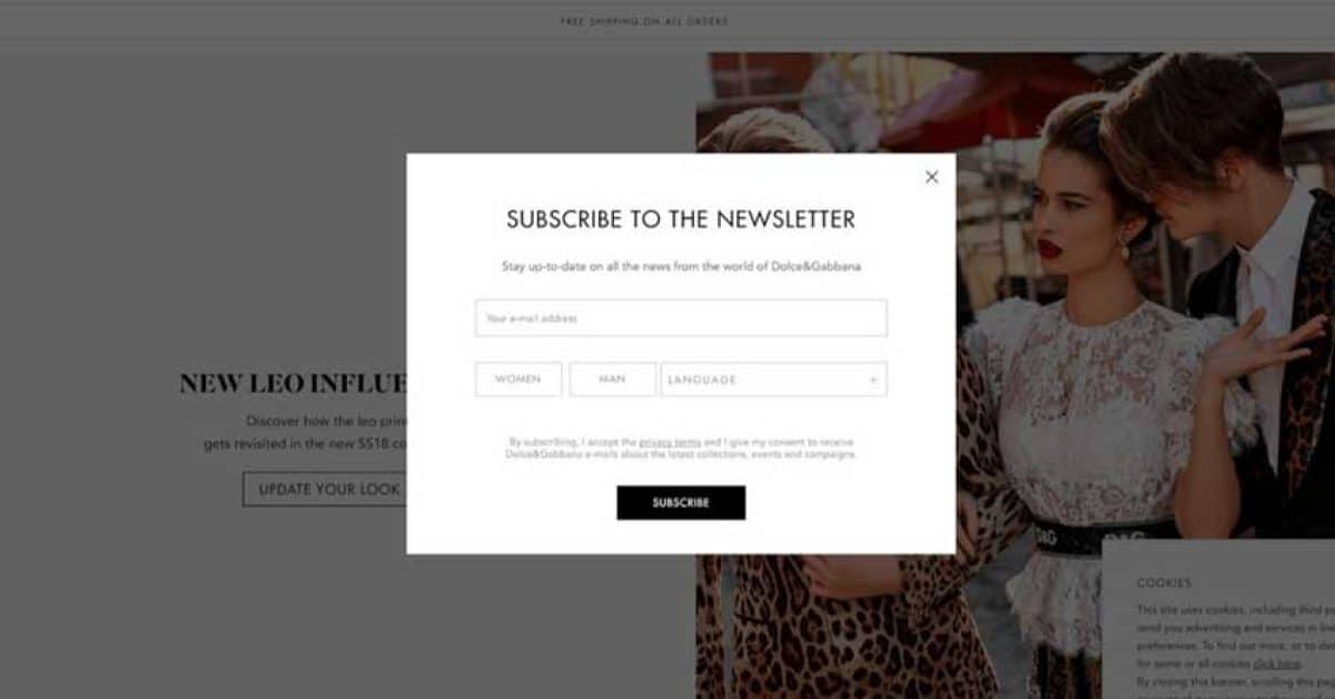
A clean white modal with “SUBSCRIBE TO THE NEWSLETTER” and subtext “Stay up-to-date on all the news from the world of Dolce&Gabbana.” Below the single email field, three preference selectors — WOMEN, MAN, LANGUAGE — let visitors personalize their subscription without adding friction. The black “SUBSCRIBE” CTA and generous white space reflect D&G’s luxury identity.
2. Tommy Hilfiger – Benefit-Driven Discount Popup
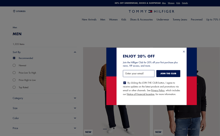
Design: A pop-up that lists specific subscriber benefits as concise checkpoints: 20% off next purchase, early access to collections and sales, birthday rewards, and exclusive member content.
What makes it work:
- Community-building language (“join the club”)
- Emotional engagement and sense of belonging
- Clear articulation of member benefits
- Strong brand voice consistency
3. Brooklinen – Benefit-Focused Popup
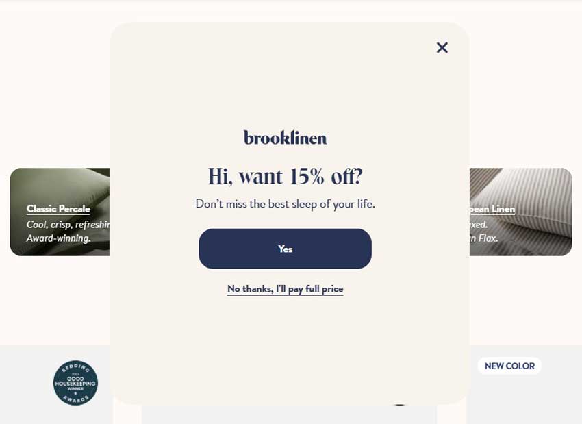
White modal with “Hi, want 15% off?” headline and “Don’t miss the best sleep of your life.” subtext. The navy “Yes” CTA is prominent, but the real genius is the decline link: “No thanks, I’ll pay full price” — a loss-aversion tactic that makes visitors think twice before closing.
4. Blume – Gamified Skincare Quiz Popup
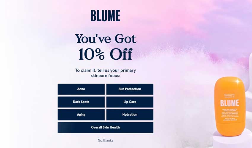
Fullscreen popup with “You’ve Got 10% Off” on a purple-pink gradient. To claim the discount, visitors select their skincare focus from 7 categories: Acne, Sun Protection, Dark Spots, Lip Care, Aging, Hydration, and Overall Skin Health. A Sunburst SPF product image anchors the right side. This two-step micro-commitment converts 5% of visitors and enables personalized follow-up emails.
5. Nature’s Fynd – Community-Driven Slide-In Popup
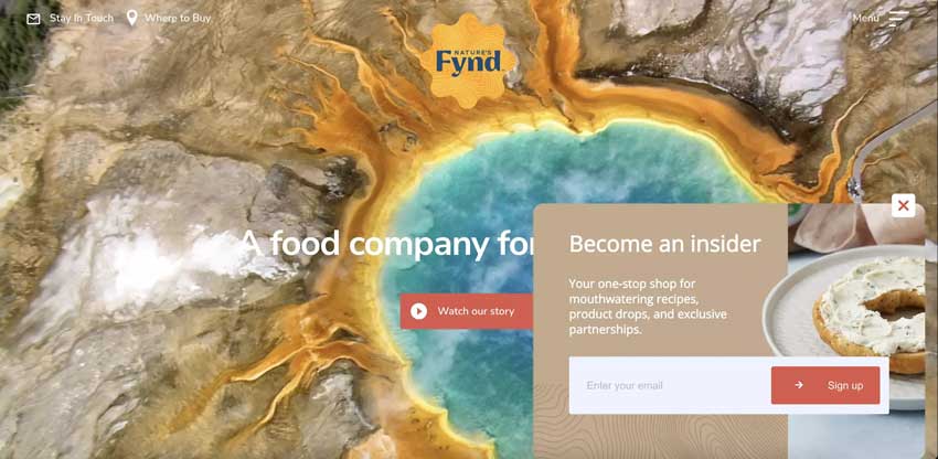
A slide-in from the bottom right with a warm tan panel reading “Become an insider” — “Your one-stop shop for mouthwatering recipes, product drops, and exclusive partnerships.” Single email field and coral “Sign up” button. The Yellowstone hot spring imagery in the background subtly reinforces the brand’s science-meets-nature origin story.
6. Rouje – Rouje — Split-Screen Popup with Discount & Preferences
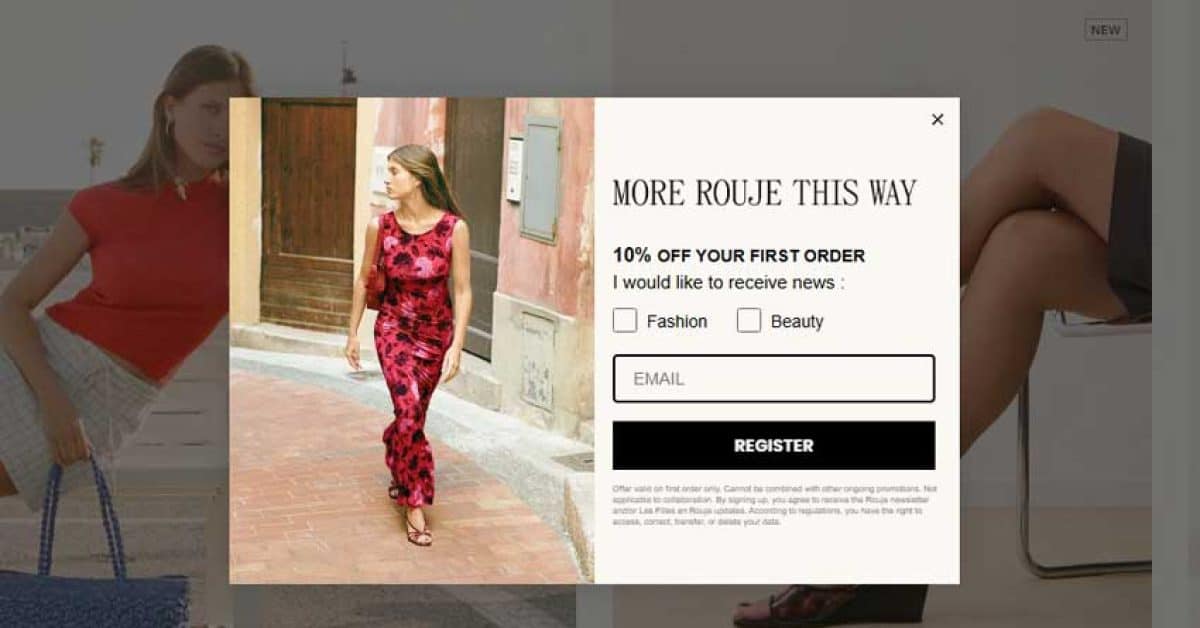
Left half: aspirational photo of a woman in a red floral dress on a Mediterranean street. Right: “MORE ROUJE THIS WAY” with “10% OFF YOUR FIRST ORDER”, Fashion/Beauty preference checkboxes, email field, and bold black “REGISTER” CTA. The lifestyle photography sells the brand while checkboxes enable self-segmentation.
7. Heatonist – Gamified Spice Level Quiz Popup
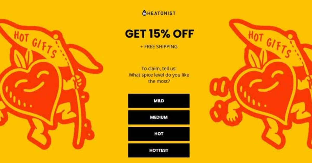
Fullscreen bright yellow popup: “GET 15% OFF + FREE SHIPPING.” To claim, visitors select their heat preference from 4 buttons — MILD, MEDIUM, HOT, HOTTEST. Red illustrated hot sauce mascots flank both sides. The gamified quiz creates engagement before email capture, and responses enable personalized product recommendations.
8. Sunbasket – Product Box Popup with Guilt-Trip Decline
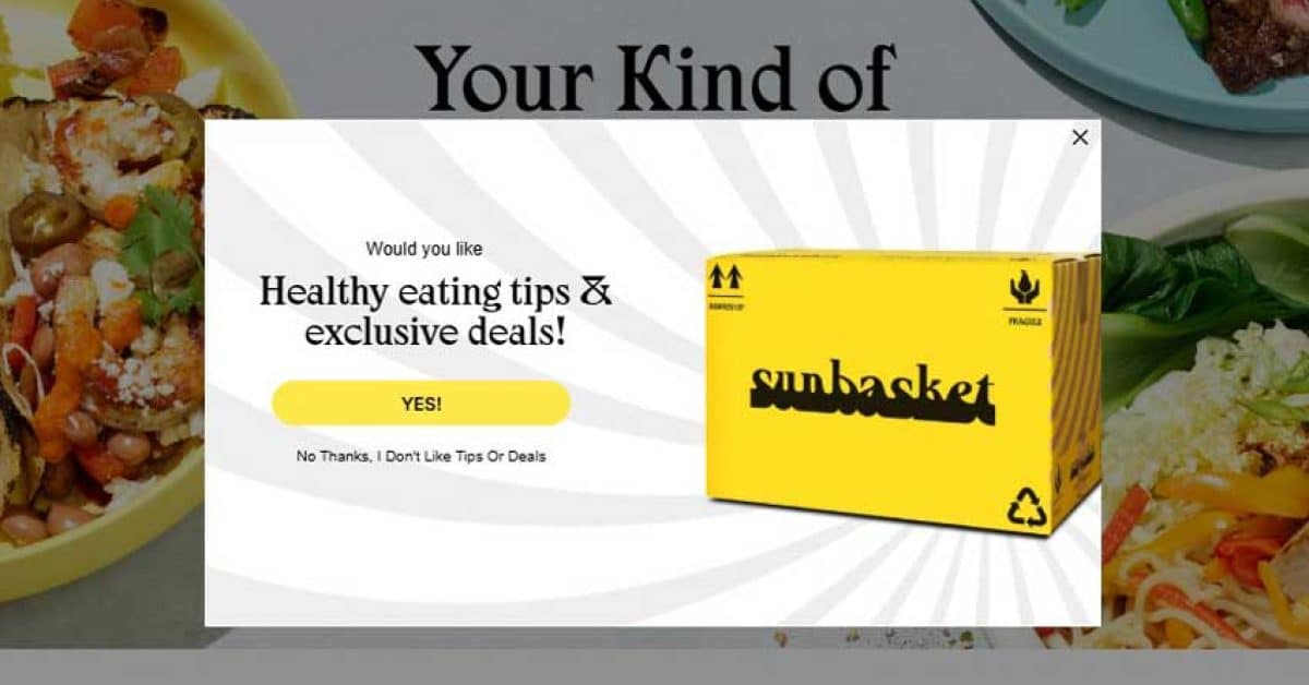
White modal over colorful meal photography. A large yellow Sunbasket delivery box image accompanies: “Would you like Healthy eating tips & exclusive deals!” Yellow “YES!” CTA, while the decline reads “No Thanks, I Don’t Like Tips Or Deals” — playful reverse psychology to boost conversions.
9. Ulta – Bold Full-Width Sticky Bar
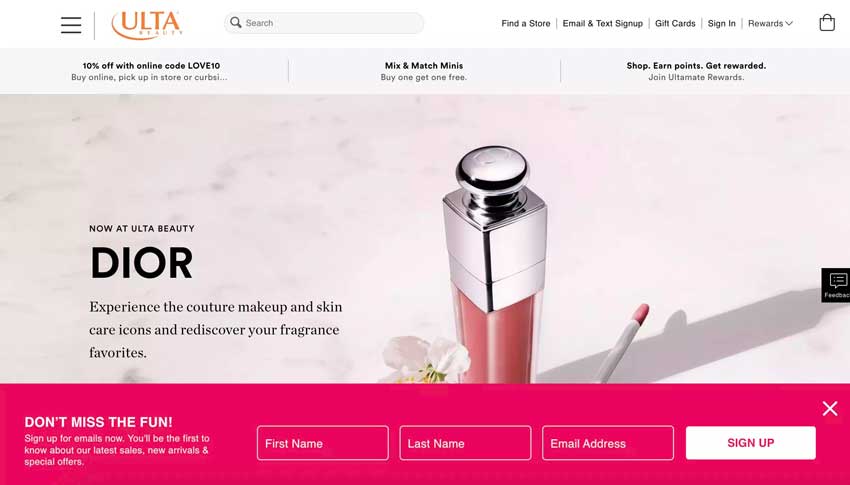
Bottom sticky bar in Ulta’s signature hot pink/magenta. “DON’T MISS THE FUN!” headline with “Sign up for emails now.” Three inline fields — First Name, Last Name, Email Address — beside a white “SIGN UP” CTA. Three-field forms convert at 7.86% on average (Wisepops), and the sticky format stays visible without blocking content.
10. Recess – Pastel Bottom Bar with Dual Fields
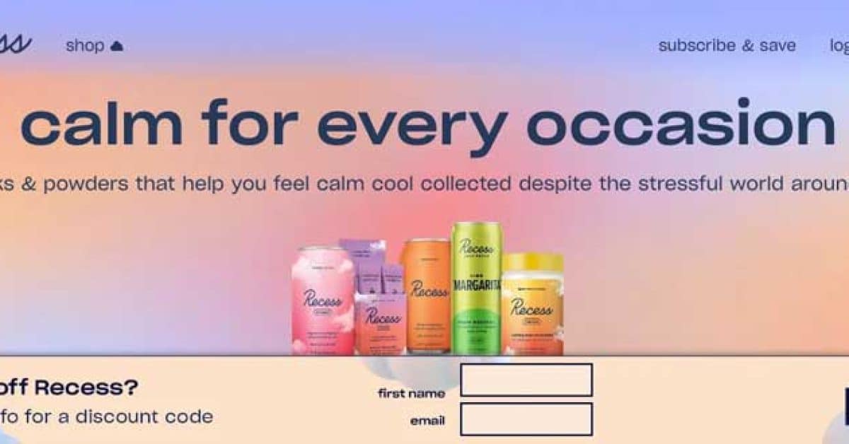
Bottom bar on Recess’s signature pastel gradient (pink/blue/peach). “want 10% off Recess?” with two fields — first name and email — beside a bordered “SIGN UP” button. The calm, lowercase copy and pastel palette match the brand’s wellness positioning perfectly.
11. Wix – Green Sticky Bar for Blog Readers
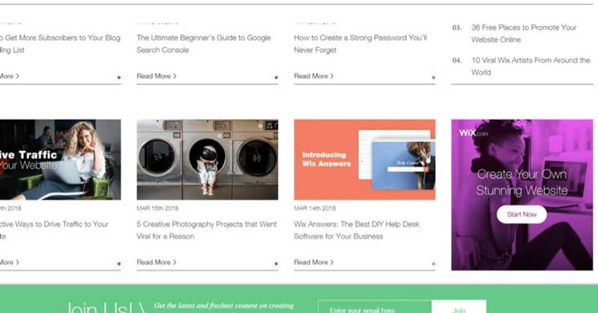
Dark green bottom bar on the Wix Blog. “Join Us!” with “Get the latest and freshest content on creating & marketing your Wix website.” Single email field and green “Join” CTA. No discounts — just relevant content, the right incentive for B2B/SaaS blog readers.
12. Orbit Media – Social-Proof Sticky Bar
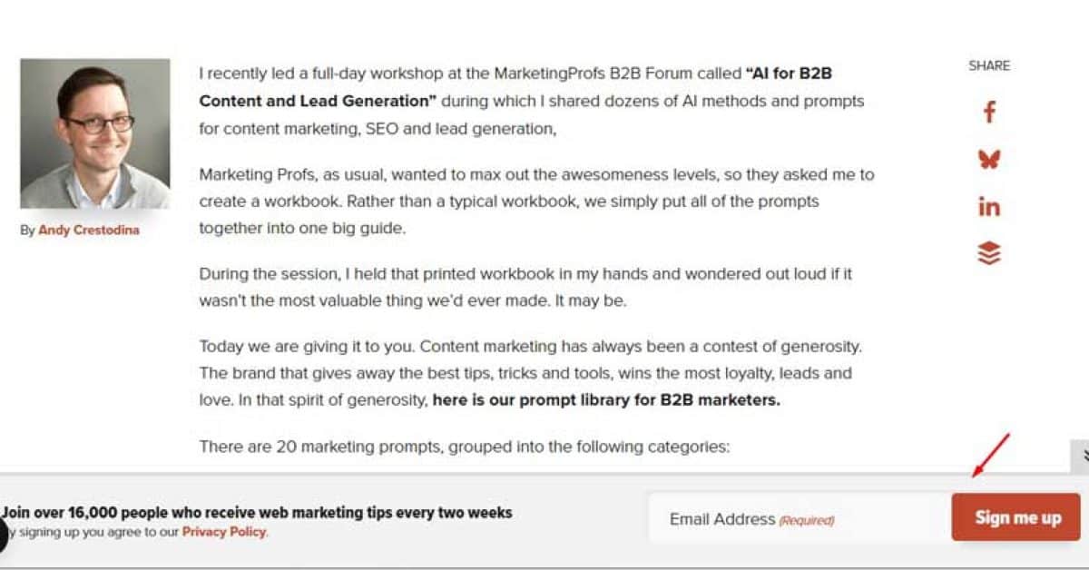
Warm brown bottom bar leading with “Join over 16,000 people who receive web marketing tips every two weeks.” Single email field, Privacy Policy link, and red “Sign me up” CTA. The “16,000 people” social proof immediately builds credibility and signals content value.
13. Fast Company – Paywall-Style Subscription Popup
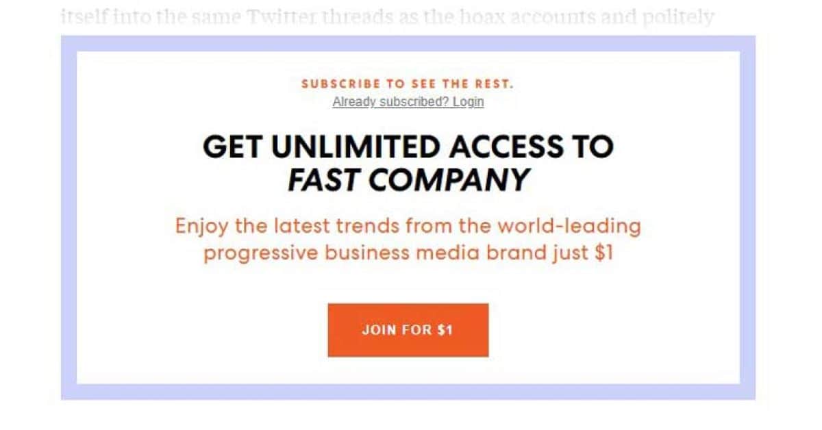
Rectangular popup with a blue/purple border. “SUBSCRIBE TO SEE THE REST” with “Already subscribed? Login” link. Bold headline: “GET UNLIMITED ACCESS TO FAST COMPANY” with an orange “JOIN FOR $1” CTA. Content gating shows partial content before locking, and the $1 trial removes the financial barrier.
14. Gaiam – Mandala-Shaped Wellness Popup
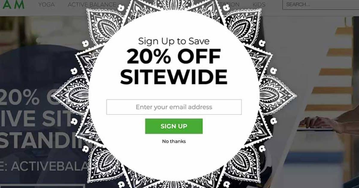
A mandala/henna-patterned circular popup on a dark overlay. White center with “Sign Up to Save 20% OFF SITEWIDE,” email field, green “SIGN UP” CTA, and “No thanks” link. The mandala shape breaks the typical rectangular pattern, and the design aligns perfectly with Gaiam’s yoga and wellness identity.
15. Nutrimuscle – Community Split-Screen Popup
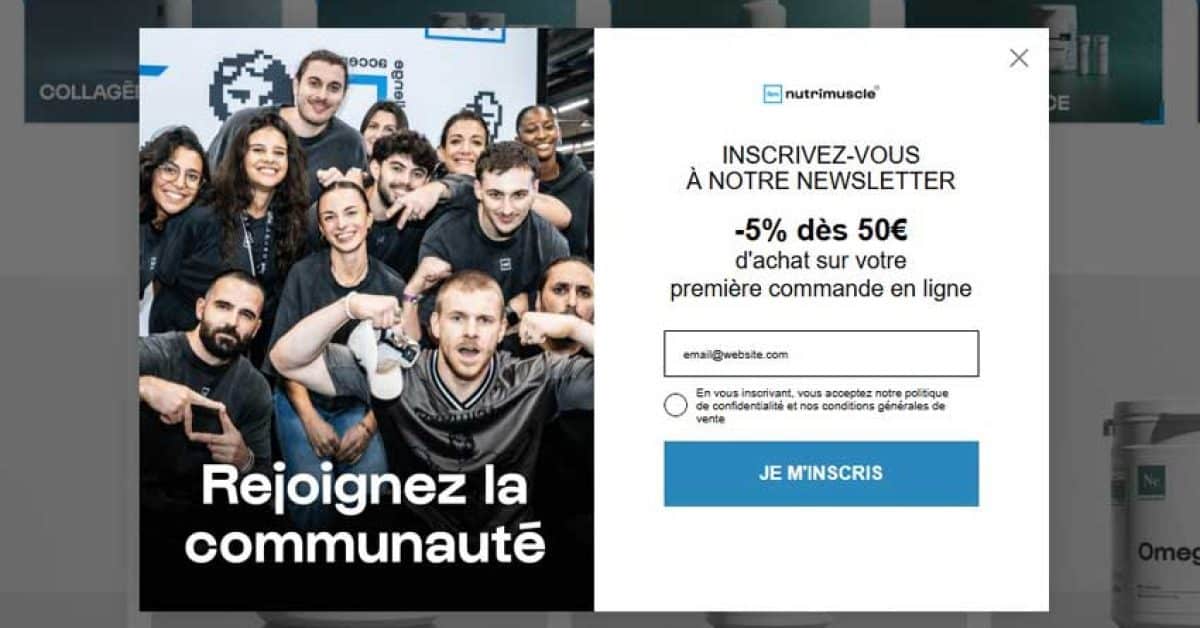
Left half: team group photo with “Rejoignez la communauté” (Join the community). Right: nutrimuscle logo, “-5% dès 50€” (5% off orders over €50) incentive, single email field, privacy checkbox, and blue “JE M’INSCRIS” CTA. The team photo humanizes the brand, and the conditional discount encourages higher order values.
Want to build your own pop-up like these? Check out our step-by-step guide: How to Add a Popup in WordPress & WooCommerce.
10 Email Popup Design Tips That Boost Conversions
Now that you’ve seen real examples, let’s break down the design principles that make email Pop-up convert.
Tip 1: Use a Compelling Value Proposition
Your headline must instantly communicate what the visitor gets. Vague copy like “Join our newsletter” converts poorly. Specific offers like “Get 15% off your first order” or “Download our free SEO audit checklist” tell visitors exactly what they’ll receive.
The data: Email Pop-up offering discounts converts at 7.45%, which is 62% higher than the Pop-up without discounts at 4.60%.
✅ “Get 20% off + free shipping on your first order”.
❌ “Sign up for our newsletter”.
Tip 2: Keep It Simple – 1–2 Form Fields Max
Every extra form field increases friction. Single-field Pop-up (email only) converts at 4.87%, and they work well for most use cases. If you need more data, use a multi-step Pop-up where the first step is low-friction (e.g., “Yes, I want 15%” → email field on step 2).
An exception: three-field forms actually convert at 7.86% in specific contexts, likely because they filter for more committed leads. Test what works for your audience.
Tip 3: Design for Mobile First
Over 60% of web traffic is mobile, and mobile pop-ups now convert 36% more than desktop Pop-ups (4.98% vs. 3.67%). Your mobile Pop-up should have:
- Large tap targets (minimum 44×44 pixels)
- Readable fonts (16px or larger)
- No more than 90–95% screen coverage
Tip 4: Use Exit-Intent Triggers for Desktop
Exit-intent Pop-up detect when a user moves their cursor toward the browser’s close button. They’re your last chance to convert an abandoning visitor — and they’re effective. Exit-intent Pop-up can recover 10–15% of abandoning visitors, with optimized campaigns converting at 15–25%.
Best for high-value offers: “Wait! Here’s 20% off before you go.”
Tip 5: Optimize Your CTA Button
The difference between “Submit” and “Get My Discount” is the difference between a 3% and an 8% conversion rate. Use action words that describe the benefit:
- ✅ “Get My Discount,” “Claim Your Free Guide,” “Start Saving Today”
- ❌ “Submit,” “Sign Up,” “Subscribe”
Make the button high-contrast (it should be the most visually prominent element on the popup) and large enough to tap on mobile.
Tip 6: Add Social Proof or Urgency
Adding a countdown timer to a popup increases conversion from 9.86% to 14.41% — a 46% boost. Other urgency and proof tactics:
- Scarcity: “Offer ends in 24 hours” (only if genuine)
- Countdown timers: Visual urgency that triggers fear of missing out
Tip 7: Match Your Brand’s Visual Style
Your popup should look like it belongs on your site — same colors, fonts, imagery style, and tone of voice. Consistency builds trust and reduces the “ad” feeling that makes visitors instinctively close Pop-up. Rouje, Blume, and Brooklinen all excel at this (as you saw in the examples above).
Tip 8: Test Timing and Triggers
Immediate Pop-up (firing on page load) are intrusive and often ignored — or worse, they violate Google’s mobile interstitial guidelines. Better trigger options:
- Scroll depth (50–70% down the page)
- Time on page (30–60 seconds after arrival)
- Exit intent (when the user moves to leave)
Click-triggered Pop-up achieve an exceptional 54.42% conversion rate because visitors who click have already self-qualified.
Tip 9: Make It Easy to Close
Always include a visible close button (X in the corner). Google penalizes mobile Pop-up that are hard to dismiss.
Best practices:
- Use a “Maybe later” option to reduce the feeling of a hard sell
Tip 10: Comply with Google’s Mobile Interstitial Rules
Google has penalized intrusive mobile pop-ups since January 2017. To stay safe:
- Don’t show full-screen Pop-up immediately on mobile for visitors arriving from search
- Use slide-ins, bars, or scroll-triggered pop-ups on mobile instead
- Ensure all pop-ups are easy to close on mobile devices
Looking for the best tools to build these pop-ups? See our comparison: 10+ Best WordPress Popup Plugins to Boost Conversions. If you use Elementor, check out the 7+ best Elementor popup & modal addons.
Email Popup Statistics You Should Know in 2026
Here are the key email popup statistics and benchmarks to guide your strategy.Metric Benchmark Source Average popup conversion rate 4.82% Wisepops, 2025 Top 10% popup campaigns 57.7% Wisepops, 2025 Popups with a discount incentive 7.45% Wisepops Popups without a discount incentive 4.60% Wisepops Single-field popup conversion 4.87% Wisepops Three-field popup conversion 7.86% Wisepops New visitor popup conversion 8.30% Focus Digital, 2026 Click-triggered popup conversion 54.42% Wisepops / Focus Digital, 2026 Exit-intent popup recovery 10–15% of abandoning visitors Wisernotify Optimized exit-intent conversion 15–25% Wisernotify Mobile popup conversion 4.98% Wisepops Desktop popup conversion 3.67% Wisepops Mobile vs desktop 36% higher on mobile Wisepops Popup without a countdown timer 9.86% Wisepops Popup with countdown timer 14.41% Wisepops eCommerce popup conversion 6.88% Wisepops, 2025 URL-targeted popup 5.53% (130% higher than non-targeted) Wisepops
The data tells a clear story: offering a specific incentive, targeting by visitor behavior (new vs. returning, URL-specific), and optimizing triggers (click, exit-intent) are the three highest-leverage changes you can make to boost email popup performance.
How to Build Email Popups Like These for Your WooCommerce Store
Studying these examples is one thing — actually building them is another. If you run a WooCommerce store and want to recreate these popup strategies, you’ll need a tool that supports behavior-based triggers, discount conditions, and product-level targeting. Here are some of the most capable options:
ShopLentor (Popup Builder Module)
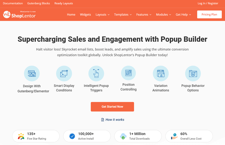
ShopLentor’s Popup Builder is built specifically for WooCommerce stores. It gives you prebuilt templates, a drag-and-drop editor, and an intuitive dashboard to manage all your popups in one place. You can set precise display conditions, target specific pages, products, or user segments, and trigger popups based on exit intent, scroll depth, time on page, or button clicks.
Key features:
- Unlimited popup templates with full design customization
- Behavior-based triggers: exit intent, scroll depth, time delay, click
- Product and page-level targeting rules
- Drag-and-drop builder with prebuilt templates
- Seamless integration with Elementor and Gutenberg
- Centralized popup management dashboard
Sender
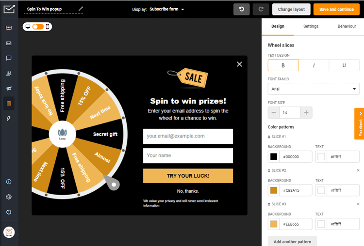
Sender is a powerful email marketing software tailored for startups, small businesses, and ecommerce stores. The platform offers high-converting popups and forms that help you capture quality leads.
To make your popup campaigns more engaging and exciting, try Sender’s spin-to-win popup template. You can adjust it however you want — edit copy, design, and prizes to create an interactive experience that motivates visitors to sign up for your offers.
But Sender is more than just a popup tool. It’s an effective marketing automation platform that helps you create personalized emails to boost engagement and sales.
Key features:
- High-converting popups like exit-intent and spin-to-win
- Email and text marketing automation
- Drag-and-drop email builder and responsive templates
- Advanced segmentation and personalization
- Detailed analytics and reports
- Seamless integration with platforms like WordPress and Shopify
- High email deliverability
- 24/7 customer support with a 99% satisfaction rate
OptinMonster
OptinMonster is one of the most established popup tools available, supporting a wide range of formats — lightbox modals, inline opt-in forms, floating bars, and slide-ins. Its strength lies in advanced targeting: you can segment by referral source, device type, geolocation, on-site behavior, and more. The drag-and-drop builder requires no coding, and it integrates with most major email marketing platforms.
Key features:
- Drag-and-drop campaign builder
- Multiple popup formats: lightbox, floating bar, slide-in, inline
- Advanced audience targeting and segmentation
- Exit-intent, scroll, and click-based triggers
- Onsite retargeting and coupon wheel opt-ins
- Pre-built campaign playbooks
Wisepops
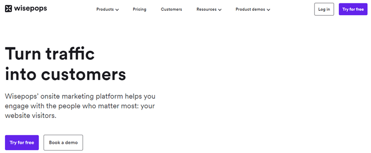
Wisepops is a dedicated popup builder that works across WordPress and Shopify. It comes with 60+ prebuilt templates and connects directly with major CRM and marketing platforms including HubSpot, Drip, GetResponse, and Infusionsoft. It’s a solid choice if you need fast setup without sacrificing targeting control.
Key features:
- 60+ prebuilt popup templates
- CRM and email platform integrations
- SMS/text marketing support
- Full design customization
- Page and audience-level targeting
Privy
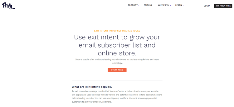
Privy is built for Shopify store owners who want to reduce cart abandonment and capture leads at the moment of exit. Its exit-intent popups, spin-to-win campaigns, and flyouts are straightforward to set up and integrate directly with Shopify’s ecosystem.
Key features:
- Exit-intent popups and flyouts
- Spin-to-win campaign templates
- Email capture and automated follow-up sequences
- Shopify-native integration
Frequently Asked Questions
What is a good conversion rate for an email pop-up?
The average email pop-up conversion rate is 4.82%, but top-performing pop-ups achieve 15–25% or higher. Exit-intent pop-ups typically convert at 15–25% (ConversionXL via Koanthic), while click-triggered pop-ups can reach 54%+. Your conversion rate depends on your offer, design quality, targeting, and audience.
What’s the best incentive for an email popup?
Discount codes are the most effective incentive. Pop-ups offering discounts convert at 7.45%, compared to 4.60% without any incentive. Other high-converting offers include free shipping, exclusive content (ebooks, guides), early access to sales, or free tools. The key is to offer something valuable enough to justify giving up an email address.
Should I use a one-step or two-step popup?
Two-step Pop-up (where users click a button first, then see the email field) often converts better because the initial click creates a micro-commitment. Blume, Nutrimuscle, and Pierre Hardy all use multi-step flows successfully. However, one-step pop-ups are simpler and work well when the offer is strong enough on its own. Test both to find what works for your audience.
How do I make my email pop-up mobile-friendly?
Use large tap targets (minimum 44×44 pixels), readable fonts (16px or larger), a clearly visible close button, and avoid full-screen overlays on mobile. Google penalizes mobile Pop-ups that cover content immediately after a user arrives from a search. Use scroll-triggered or exit-intent pop-ups on mobile instead.
Can I show a different Pop-up to different visitors?
Yes. Most pop-up builders let you segment by device type, geographic location, referral source, page visited, or visitor behavior (new vs. returning). New visitor pop-ups convert at 8.30%, while returning visitor pop-ups convert at 5.09%. For example, show a first-time visitor a welcome discount and show a returning visitor a loyalty program signup.
When should I trigger my email pop-up?
Avoid triggering a pop-up immediately on page load — this both annoys visitors and risks a Google penalty on mobile. Best practices: exit-intent for desktop, scroll depth (50–70% down the page), time delay (30–60 seconds after arrival), or click-triggered (user clicks a specific element). Click-triggered pop-ups achieve a 54.42% conversion rate because visitors have already shown intent.
How often should I show my email popup to the same visitor?
Set a frequency cap so visitors don’t see the same pop-up every page load. Common practice: show once per session, or once every 7–30 days. If someone closes the pop-up, respect their decision and don’t show it again immediately. Most pop-up builders offer built-in frequency controls for this.
Are email popups bad for SEO?
No — only if implemented wrong. Google penalizes full-screen popups that cover content immediately on mobile for search visitors. Use scroll-triggered or exit-intent popups instead, keep a visible close button, and you’re safe. Cookie consent and age verification popups are exempt.
What popup type works best for WooCommerce stores?
Exit-intent discount popups and cart abandonment popups perform best. Exit-intent recovers 10–15% of abandoning visitors. Cart abandonment popups convert up to 17.12% (OptiMonk, 2025) because the visitor already showed purchase intent. Product-specific popups triggered on individual product pages also work well.
How many times should I show a popup to the same visitor?
Once per session, or once every 7–30 days. If someone closes without converting, suppress it for at least a week. Most popup builders have built-in frequency controls for this.
Final Thoughts
The best email pop-up combines compelling offers, a clean design, smart timing, and mobile optimization. By studying real examples from brands like Dolce & Gabbana, Brooklinen, Blume, and Nutrimuscle, and applying the 10 design tips above, you can move your popup conversion rate well above the 4.82% average.
Ready to build your own high-converting email popup? Start by understanding the fundamentals in our popup builder guide, then choose the right tool from our best WordPress popup plugins comparison.
If you build with Elementor, explore the best Elementor popup addons for seamless integration. And when you’re ready to launch, follow our step-by-step tutorial on adding a popup in WordPress to go live in minutes.