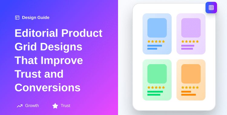
Editorial Product Grid Designs That Improve Trust and Conversions
In a market worth over $6.4 trillion globally, every second counts, and the first impression your product grid makes determines whether customers stay or leave. 94% of first impressions are design-related, and your product display layout is often that critical first touchpoint.
The problem is stark. Standard product grids treat all items equally, cramming as many products as possible into a single view. They feel transactional, impersonal, and forgettable. Meanwhile, 84% of users rate website design consistency as crucial to trust, yet most e-commerce stores overlook the strategic power of layout design in building that trust.
What separates thriving online stores from struggling ones isn’t product quality, it’s presentation. Editorial product grid designs bridge this gap by applying magazine-style design principles to e-commerce, creating layouts that are simultaneously beautiful and conversion-optimized.
These grids combine visual hierarchy, strategic white space, premium typography, and thoughtful product curation to elevate the shopping experience from transactional to aspirational.
This guide reveals exactly how editorial product grid designs work, why they drive higher conversion rates, and how to implement them without technical expertise.
ShopLentor- WooCommerce Builder for Elementor & Gutenberg
A versatile page builder to build modern and excellent online stores with more than 100k+ Active Installations.
Key Takeaways
- Grid layout design changes customer purchasing behavior
- 94% of first impressions are determined by design
- Editorial grids reduce cognitive load and boost conversions
- White space and hierarchy build trust instantly
- Magazine-style layouts increase perceived product value significantly
- Modular grids outperform basic layouts for premium brands
What Are Editorial Product Grid Designs?
Editorial product grid designs represent the convergence of print magazine aesthetics and e-commerce functionality. Unlike standard product grids that display items in uniform, monotonous rows, editorial grids intentionally vary layout, size, spacing, and visual hierarchy to create a curated, gallery-like shopping experience.
The core concept draws inspiration from editorial design—the art of arranging information in a visually compelling way that guides reader attention. When applied to e-commerce, editorial grids don’t just showcase products; they tell a story about your brand’s values, style, and expertise.
Key components include:
- Visual hierarchy: Directing attention through size variation, color, contrast, and positioning.
- White space: Creating breathing room that reduces cognitive load and emphasizes important elements.
- Grid structure: Using 3-4 column systems that provide organization without rigidity.
- Premium typography: Employing elegant fonts that communicate quality.
- Strategic color and contrast: Using accents to create focal points.
- Product presentation: High-resolution images and contextual information positioned strategically.
Premium brands like Hermès, John Lewis, and luxury fashion retailers invest heavily in editorial-style product displays because they understand a fundamental truth: how you present products influences whether customers see them as commodities or investments. The “editorial” label signals to customers that they’re viewing a curated selection from experts, not just an inventory dump.
The Psychology Behind Editorial Grids
When customers arrive at your shop page, their brains process visual information at incredible speed. Within 2.6 seconds, they’ve already formed judgments about your store’s trustworthiness and professionalism. That’s where editorial grids excel, they communicate sophistication and intentionality faster than any copy ever could.
Consider how the eye moves across a standard uniform grid versus an editorial grid. With uniform grids, the eye bounces randomly, unable to determine what matters. With editorial grids using strategic variation in module size, you create a visual hierarchy that naturally guides attention toward featured or best-selling items.
The conversion impact is measurable. Stores that implement editorial grid layouts report improved engagement: longer time-on-page, higher click-through rates, and better conversion rates. Why? Because customers spend time actually considering products rather than feeling overwhelmed by choice paralysis.
The word “editorial” carries psychological weight. It implies curation, expertise, and storytelling—qualities that differentiate premium retailers from commodity sellers. When customers see an editorial grid, their brain unconsciously categorizes your store as more sophisticated and more trustworthy.
Choosing the Right Grid Layout for Your Products
Not all products benefit from the same grid structure. The optimal layout depends on your product category, audience, brand positioning, and conversion goals. Understanding the strengths of each grid type ensures you’re optimizing for your specific needs.
Column Grids: Simplicity and Uniformity
A column grid displays products in fixed columns (typically 3-4 on desktop). All modules are the same size, creating a uniform, Scandinavian-style aesthetic. This grid type is ideal for:
- Brands with consistent product sizes (e.g., all apparel, all mugs, all books)
- Stores targeting customers who primarily compare similar items
- Mobile-first retailers (column grids collapse cleanly to 1-2 columns on mobile)
- Budget-conscious stores where uniformity feels appropriate to positioning
Conversion benefit: Column grids reduce perceived price difference. All products feel “equal,” which helps budget retailers avoid luxury price-point anxiety. The simplicity also reduces decision friction.
Modular Grids: Versatility and Flexibility
Modular grids use equal-sized base modules that can be combined (2×2, 2×1, etc.) to create variation while maintaining underlying structure. This is the sweet spot for most editorial product presentations—it provides visual variety without feeling chaotic.
This grid type works exceptionally well for:
- Retailers with varied product sizes (mixing featured collections with standard items)
- Brands wanting curated, editorial-style presentations
- Stores balancing multiple product lines (e.g., shoes + accessories + apparel)
- Premium and mid-tier brands
Conversion benefit: Modular grids create visual interest without overwhelming customers. They guide attention through size variation while maintaining an organized structure. This is often called the “Goldilocks” approach—not too rigid, not too loose.
Hierarchical Grids: Dynamic Emphasis
Hierarchical grids abandon module uniformity entirely, deliberately varying sizes to emphasize important products. A hero module (2-3x standard size) anchors the layout, with secondary and tertiary products around it in descending size order. This is the premium approach.
Best suited for:
- Luxury and high-end brands
- Seasonal product launches requiring emphasis
- Curated collections where you want to direct customer focus
- Stores with bestsellers or hero products that deserve prominent positioning
- Image-first merchandising, where visual beauty is the primary purchase driver
Conversion benefit: Hierarchical grids maximally guide customer attention and create a narrative structure. They communicate editorial curation most strongly and work best when combined with premium typography and high-quality photography.
Baseline Grids: Alignment and Text Precision
A baseline grid uses invisible horizontal lines to align text elements across all products. This grid system prioritizes text consistency and readability over size variation, making it ideal for:
- Text-heavy product displays (specs, descriptions, detailed pricing)
- B2B or technical product stores
- Retailers where price comparison is the primary intent
- Info-first merchandising where detailed information precedes visual appeal
Conversion benefit: Baseline grids reduce cognitive load by making information predictable. Customers know exactly where to find price, availability, and specs on every product.
Decision Matrix: Matching Grid Type to Your Products
| Product Category | Optimal Grid Type | Reasoning |
| Fashion (clothing) | Modular or Hierarchical | High-quality imagery is primary; variation creates interest |
| Luxury goods | Hierarchical | Curation and premium positioning require emphasis |
| Electronics/specs-driven | Column or Baseline | Uniformity and detailed information matter most |
| Home goods/furniture | Hierarchical or Modular | Mix of visual appeal and functional information |
| Books/uniformly-sized items | Column Grid | Consistency matches product consistency |
| Curated collections | Hierarchical | Editorial storytelling requires size variation |
| Budget retail | Column Grid | Uniformity communicates value positioning |
Now that you understand grid types, implementing one is simpler than ever. If you’re using WooCommerce with Elementor, the ShopLentor Product Grid Editorial Widget offers multiple layout options that let you implement all of these grid types without coding.
With its drag-and-drop interface, you can build modular or hierarchical grids in minutes, controlling:
- Grid structure (columns, spacing, gaps)
- Module sizing (single, double-width, featured sizes)
- Typography (font family, size, spacing)
- Product images (sizing, aspect ratios)
- Load More vs. Infinite Scroll pagination
- Grid view vs. List view toggle
The widget handles responsive design automatically, collapsing layouts intelligently on mobile devices. This means you can design a beautiful hierarchical grid on a desktop knowing it will reorganize sensibly for phone users without any additional coding.
To implement your chosen grid type, head to the WooLentor documentation on their Product Grid Editorial widget. You’ll find step-by-step tutorials for both Elementor and Gutenberg editors. The tool’s customization options align perfectly with each grid type we’ve discussed. Whether you choose uniformity or variation, the widget adapts.
Color, Typography, and Trust Signals in Editorial Layouts
The visual language you choose communicates volumes about your brand before a customer reads a single word of product copy. Color, typography, and strategic trust indicators work together to establish credibility and positioning.
Premium Typography: The Silent Communicator
Font choice signals quality level. A serif font like Playfair Display immediately communicates luxury and tradition. Notice how high-end brands from Hermès to luxury fashion houses use classical serif typography. Sans-serif fonts like Roboto feel modern and approachable, while display fonts like Montserrat signal contemporary premium positioning.
Practical guidelines:
- Product names: Use a premium serif font (Playfair, Cormorant, or Lora) for luxury positioning; modern sans-serif (Montserrat, Poppins) for contemporary brands
- Pricing: Slightly smaller than product names, often a different weight or color to differentiate
- Descriptions: Readable font (Helvetica, Inter, Roboto) in 14-16px, with adequate line spacing
- Labels (New, Sale, Featured): Distinct font or styling to stand out without clashing
The key: consistency. Use no more than 2-3 fonts in your grid. Too many fonts create visual noise and reduce trust.
Color Psychology in Product Grids
Golden accents on neutral (white, beige, grey) backgrounds communicate luxury, warmth, and exclusivity. This is why you see gold used extensively in jewelry, beauty, and fashion retail. It literally makes products look more valuable.
High contrast (dark text on light backgrounds, or vice versa) improves readability and guides attention. Use contrast selectively: if everything is high-contrast, nothing stands out.
Color psychology basics:
- Gold/Bronze: Luxury, premium, exclusivity
- Navy/Deep Blue: Trust, professionalism, stability
- Warm Neutrals (Beige, Taupe): Approachability, warmth, refinement
- White Space: Clarity, simplicity, premium positioning
- Green: Growth, natural, eco-conscious positioning
- Accent colors (bright against neutral): Draw attention, create emphasis
Trust Signals in Editorial Layouts
Trust signals, visual elements that communicate safety, expertise, and credibility—should be incorporated into your editorial grid strategically:
- Security badges (Trust badges, SSL indicators) near checkout-related products
- Social proof elements (review stars, user count) are integrated naturally within modules
- Certification badges (organic, fair-trade, etc.) for relevant products
- Consistent branding across all modules (same logo, colors, typography)
- High-quality imagery (no low-res, pixelated, or amateur photos)
Notice that the most effective trust signals are subtle; they’re woven into the design rather than screaming for attention. A small 5-star review indicator in the corner of a product image communicates credibility without disrupting visual flow.
Image Quality and Product Presentation
78% of users rate product image quality as critical for trust, making imagery your most important trust-building tool. Yet this is where many retailers cut corners, using low-resolution, poorly-lit photos that undermine the entire editorial experience.
The High-Resolution Imperative
Product images in editorial grids should be:
- At least 1000x1000px (larger for zoom functionality)
- Sharp and clear, even at small module sizes
- Consistently lit across all products (not mixing studio lighting with phone photos)
- Consistently styled (white backgrounds for uniformity, or styled backdrops if that’s your brand)
When customers see even one low-quality image among premium-looking products, their trust in the entire store drops. It says, “This retailer doesn’t care about details,” which creates purchase hesitation.
Multi-Angle Imagery and Zoom Functionality
Luxury retailers know that customers want to “feel” products before buying. Provide multiple angle images (front, back, detail, lifestyle) and consider hover-zoom functionality that lets customers examine texture, stitching, and finish. This significantly reduces return rates while increasing customer confidence.
For modular grids, you can display a primary image in the main view, with additional angles revealed on hover or in a quick-view modal.
Image Sizing Within Grid Systems
Images should:
- Fill their module completely but not appear stretched or distorted (use proper aspect ratio discipline)
- Have consistent aspect ratios across products (consistency builds professionalism)
- Leave padding around edges (not cutting off content, not bleeding to edges)
- Display product context when relevant (lifestyle shots alongside studio shots for fashion, jewelry in-use scenarios for accessories)
Alt Text Optimization for Accessibility and SEO
Many retailers treat alt text as an afterthought, but it serves dual purposes: accessibility for screen-reader users and keyword signaling for search engines.
Effective alt text describes both the product and its context without keyword stuffing:
- Poor: “blue dress”
- Good: “cobalt blue linen midi dress with button-front closure”
- Poor: “product image”
- Good: “silk pillowcase in ivory, displayed on white pillow showing lustrous finish”
Impact on Click-Through Rates
Products with clear, professional thumbnails receive approximately 30% higher click-through rates than products with blurry or inconsistently styled images. This isn’t just aesthetic preference—it’s psychology. Customers equate image quality with product quality and retailer trustworthiness.
Action item: audit your current product images. Replace any that fall below professional standards. This single change often yields 10-15% CTR improvement on product grids.
Balancing Image-First vs. Info-First Grid Designs
The endless debate in e-commerce design revolves around a fundamental question: should you emphasize beautiful product imagery or detailed product information first? The answer depends on your product category and customer behavior.
Image-First Grids: Emotional Engagement
Image-first grids prioritize visual storytelling. Product images dominate the module, with pricing and basic information below. This approach works when:
- Visual appeal drives purchases (fashion, home décor, luxury goods)
- Your target audience is drawn by aesthetics rather than specs
- Price is not the primary concern (premium positioning)
- The product category benefits from emotional connection (jewelry, art, fashion, wellness)
Conversion strength: Image-first grids create desire. They engage the emotional brain before the analytical brain, resulting in higher perceived value and better positioning for premium pricing.
Weakness: They may underperform with price-sensitive or specification-focused customers who want immediate access to information.
Info-First Grids: Transparency and Comparison
Info-first grids show product name, price, key specs, and rating information prominently, with smaller images. This approach excels when:
- Price comparison drives decisions (budget retail, electronics, commodities)
- Specifications matter more than aesthetics (technical products, B2B items)
- Your audience is efficiency-focused (they know what they want and want quick comparison)
- Trust is built through information (detailed descriptions, specs, customer reviews)
Conversion strength: Info-first grids reduce friction for comparison-focused shoppers. They communicate transparency and make decision-making faster.
Weakness: They feel transactional and can undermine premium positioning. A luxury brand using info-first grids signals “commodity” rather than “curated.”
The Hybrid Approach: Sequential Visual-to-Informational Flow
Modern editorial grids increasingly use a hybrid approach:
- Initial view: Large, beautiful product image fills most of the module
- Lower section: Product name, rating, price clearly displayed
- Hover state: Additional information appears (size guide, material, care instructions)
- Detail page: Full specifications, additional images, detailed descriptions
This approach captures emotional engagement while providing information availability. It works across product categories and appeals to both visual and analytical customer types.
Implementation: Most modern product grid tools, including WooLentor’s widget offerings, support this hybrid approach natively. You can set module height, image aspect ratio, and information placement flexibly.
Conversion Data: Matching Grid Strategy to Category
Research indicates:
- Fashion/home décor: Image-first grids convert 15-20% better
- Electronics/specs-dependent: Info-first grids convert 12-18% better
- Luxury goods: Image-first with selective information converts 20-25% better
- Mid-tier products: Hybrid approach typically optimal
The implication: test both approaches, but start with the category best practice. If you sell luxury jewelry, defaulting to image-first design respects how your customers actually shop. If you sell electronics, providing specifications prominently respects your audience’s decision-making process.
Mobile Optimization and Responsive Grid Design
With mobile commerce accounting for 44% of global e-commerce sales ($710 billion in 2025), optimizing your editorial grid for mobile is not optional—it’s essential for survival.
The challenge: design principles that work beautifully on desktop often fail on mobile. A hierarchical grid with a 2×2 featured module looks elegant on a 27-inch monitor. On a 5-inch phone, that same design becomes unusable.
Responsive Grid Breakpoints and Column Collapsing
Professional editorial grids use responsive breakpoints to intelligently reorganize at different screen sizes:
Desktop (1024px+):
- 3-4 columns for standard products
- 2-column width for featured modules (2x grid space)
- 24-32px gaps between modules
- Generous white space supporting premium positioning
Tablet (768-1023px):
- 2-3 columns (adjust based on your content)
- Featured modules remain 2x width, fitting within 2-column layout
- 16-20px gaps
- White space reduced but not eliminated
Mobile (320-767px):
- 1-2 columns (single column for premium positioning, 2 columns if needed for variety)
- All modules same width (featured modules can use full width + extra height instead of horizontal spanning)
- 12-16px gaps
- Information becomes more prominent relative to image
- Touch-friendly sizing (minimum 44px interactive elements)
WooLentor’s Product Grid Editorial widget handles these breakpoints automatically, but understanding them helps you configure settings optimally.
Touch-Friendly Product Information Hierarchy
Mobile users touch, not hover. Your information architecture must adapt:
Mobile information priority:
- Product image (primary, full width)
- Product name (clear, 16-18px minimum)
- Price (prominent, 14-16px)
- Rating/reviews (optional, if available immediately)
- Add-to-cart button (big, thumb-reachable)
Details like “Material: Silk” or “Care Instructions” should be one tap away (in a collapsible section or product detail page), not taking up valuable mobile real estate.
Load Time Optimization for Grid-Heavy Pages
Image-heavy editorial grids can become slow on mobile. Combat this with:
- Lazy loading (images load only as user scrolls into view)
- Image compression (modern formats like WebP at optimal resolution for screen size)
- Pagination or Load More (rather than infinite scroll, which loads unlimited images)
- Optimized code (grid framework should be lightweight)
A 1-second delay in page load reduces conversions by approximately 7%. Every optimization matters.
Mobile-first philosophy: design for mobile first (simplest, lightest version), then enhance for larger screens. This ensures your base experience is optimized for the majority of traffic.
Mobile-Specific Conversion Enhancements
- One-tap checkout for returning customers
- Mobile wallets (Apple Pay, Google Pay) for friction reduction
- Clear trust signals (returns policy, shipping info visible above the fold)
- Fast-loading product pages (average time: under 2 seconds)
- Reduced form fields (minimal information required to proceed)
How to Use Product Grid – Editorial Layout for Elementor | ShopLentor (Step-by-Step)
Implementation Best Practices Using WooLentor’s Product Grid Editorial Widget
If you’re using WooCommerce with Elementor or Gutenberg, you don’t need custom development to implement professional editorial grids. WooLentor’s Product Grid Editorial widget provides all necessary features within a no-code interface.
Why WooLentor for Editorial Grids?
WooLentor (ShopLentor) is purpose-built for WooCommerce product presentation. The Product Grid Editorial widget specifically offers:
- 6 modern layout options (column, modular, hierarchical variants)
- Fully customizable grid structure (control columns, spacing, gaps)
- Typography control (font family, size, weight, line height for every element)
- Image sizing (aspect ratio, sizing behavior, zoom on hover)
- Advanced filtering (show products by category, tag, on-sale status, etc.)
- Pagination options (Load More, Infinite Scroll, standard pagination)
- Grid view and list view toggle (customer choice)
- Responsive design (automatic mobile optimization)
- No coding required (drag-and-drop in Elementor, visual controls in Gutenberg)
Step-by-Step Implementation
1. Enable the Widget:
Navigate to ShopLentor > Settings > Elements, find “Product Grid Editorial,” and toggle it on.
2. Create or Edit a Page:
Open the page where you want your editorial grid in Elementor (or Gutenberg).
3. Add the Widget:
Search for “Product Grid Editorial” in the widget library and drag it into your page.
4. Configure Layout:
- Choose your grid type (column, modular, or hierarchical)
- Set column count (recommended: 3-4 for desktop, auto-collapse to 2-1 for mobile)
- Adjust spacing and gaps (recommended: 20-28px)
- Set padding around modules (12-16px inside modules)
5. Select Products:
- Choose display method (all products, specific category, featured, on-sale, etc.)
- Set products per page
- Configure pagination (Load More typically best for discovery)
6. Style Typography:
- Product name: premium font, 18-20px, bold
- Price: 16-18px, slightly lighter weight
- Description: optional, 13-14px, gray color
- Labels (New, Sale): distinct styling
7. Configure Images:
- Set aspect ratio (3:4 for fashion, 1:1 for most others)
- Enable hover zoom (improves perceived image quality)
- Add spacing around images within modules
8. Add Trust Signals:
- Enable rating display (if you have reviews)
- Display sale/featured badges
- Add custom labels as needed
9. Test Responsiveness:
Preview on mobile, tablet, and desktop. Verify that grid collapses sensibly and all information remains accessible.
10. Launch and Monitor:
Monitor click-through rates, time-on-page, and conversion metrics. A/B test different grid configurations (3 vs. 4 columns, different spacing, image sizes) to find your optimal layout.
Advanced ShopLentor Features for Editorial Grids
- Dynamic Content: Set up rules to show different products to different customer segments (first-time visitors see bestsellers, returning customers see personalized recommendations).
- Multiple Grid Sections: Use multiple Product Grid Editorial widgets on the same page with different configurations, featured collection at top, then by-category sections below.
- Integration with Other ShopLentor Widgets: Combine Product Grid Editorial with product filters, sorting widgets, and wishlist functionality for complete product discovery experience.
- Template Library: ShopLentor includes pre-designed shop layouts that incorporate Product Grid Editorial, these provide starting templates you can customize rather than building from scratch.
For complete documentation and video tutorials, visit the ShopLentor Product Grid Editorial documentation.
Measuring Performance: Metrics That Matter
Implementing an editorial grid is only valuable if it actually drives results. Track these metrics to measure success:
Click-Through and Engagement Metrics
Click-through rate (CTR): Percentage of grid views that result in product clicks. Baseline average is 3-5%; optimized editorial grids often achieve 6-10%. Compare your editorial grid CTR to your previous standard grid to quantify improvement.
Time-on-page: Seconds spent on the shop page. Editorial grids typically increase this by 15-30% by creating visual interest and discovery opportunities. Longer time-on-page signals engagement.
Scroll depth: Percentage of users who scroll through the entire grid. This indicates whether your grid length is appropriate and whether products are interesting enough to motivate scrolling.
Conversion Metrics
Conversion rate: Percentage of visitors who make a purchase. This is your ultimate metric. Editorial grids that improve CTR should improve conversion rate proportionally (though some additional optimization may be needed).
Average order value (AOV): Dollars spent per order. Editorial grids can increase AOV by 5-15% by showing related products and creating a perception of premium positioning.
Cart abandonment rate: Percentage of users who add items but don’t complete checkout. This shouldn’t be directly affected by grid design, but monitor it to ensure your improved traffic converts similarly.
Expected Improvement Benchmarks
Based on industry data:
- CTR improvement: 15-40% (from better visual hierarchy and focus)
- Conversion rate improvement: 8-20% (from reduced decision friction and increased trust)
- AOV improvement: 5-15% (from better product discovery and premium positioning)
- Time-on-page increase: 20-40% (from visual interest)
These benchmarks vary by industry and starting point. Budget retailers might see 5-10% conversion improvement, while luxury retailers frequently see 20-35% improvement from implementing editorial grids.
Common Pitfalls to Avoid
1. Over-crowded grids with too many columns
Displaying 6+ columns might show more products, but it creates visual overwhelm and reduces focus. Even on large monitors, 3-4 columns is optimal. More columns don’t mean more conversions—clarity does.
2. Poor image quality
Using low-resolution, poorly lit, or inconsistently styled images undermines the entire editorial presentation. If you have even one terrible image among premium-looking products, customer trust drops. Invest in professional photography or high-quality product images.
3. Inconsistent design elements
Varying typography, spacing, or styling across modules feels amateurish and reduces credibility. Consistency is a trust signal, maintain it religiously.
4. Neglecting mobile optimization
60% of e-commerce traffic is mobile. If your editorial grid looks broken or confusing on phones, you’re abandoning the majority of your audience. Test extensively on mobile devices.
5. Ignoring white space
Cramming maximum products into the available space creates cognitive overload. White space isn’t wasted space, it’s a design tool that improves focus and builds perceived value.
6. Misalignment with brand positioning
A luxury brand using dense, utilitarian info-first grids contradicts its positioning. Budget retailers using massive white space might appear unprofessional. Match your grid style to your brand.
7. Slow-loading grid pages
Image-heavy grids can become slow, especially on mobile. Optimize images, use lazy loading, and minimize code bloat. Every 100ms of additional load time costs you 1% in conversions.
Frequently Asked Questions
Q: What makes editorial product grids different from standard grids?
A: Editorial grids apply magazine-design principles using visual hierarchy, white space, and premium typography to enhance perceived product value and build trust through curated, aesthetically refined layouts. Standard grids treat products uniformly; editorial grids intentionally vary sizing and spacing to guide attention and communicate curation.
Q: How do product grid designs improve conversion rates?
A: Editorial grids reduce cognitive load by organizing information hierarchically, use white space to build trust, and employ visual hierarchy to guide users toward purchase decisions, resulting in 15-40% higher click-through rates and 8-20% conversion rate improvement in most cases.
Q: Can editorial grids work for budget-friendly e-commerce stores?
A: Yes. Editorial grids enhance perceived value and trust, allowing competitive positioning even for budget brands. Premium presentation compensates for lower price points by signaling quality, professionalism, and careful curation. Budget retailers should use modular (not too open) spacing to appear cost-conscious while remaining professional.
Q: What is the optimal number of columns for product grids?
A: 3-4 columns are optimal for desktop e-commerce grids. This balances product visibility, white space, and cognitive load. Mobile grids typically collapse to 1-2 columns for optimal readability and touch interactions. Avoid more than 4 columns, which creates overwhelm.
Q: How important is mobile optimization for editorial product grids?
A: Critical. Mobile commerce represents 44% of global e-commerce sales. Editorial grids must be fully responsive, with collapsing columns, readable typography (minimum 16px), and touch-friendly interactions (minimum 44px tap targets) to maintain conversion rates across devices.
Conclusion
Editorial product grid designs turn a generic product listing into a curated, magazine-style experience that builds trust, reduces decision friction, and nudges shoppers toward purchase. When your grid uses clear hierarchy, generous white space, strong imagery, and consistent typography, visitors perceive your store as more professional and your products as more valuable.
Design still shapes up to 94% of first impressions, and a large share of ecommerce browsing now happens on mobile, so your product grid is no longer just a layout choice, it is one of your most important trust signals. Stores that refine hierarchy, improve imagery, and simplify mobile layouts typically see higher click-through rates, longer time on page, and meaningful conversion lifts.
You do not need custom development to get there. With a purpose-built tool like WooLentor’s Product Grid Editorial widget, you can implement modular or hierarchical grids, tune spacing and typography, and ship a fully responsive layout directly inside Elementor or Gutenberg. That lets you experiment with editorial layouts quickly, instead of waiting on bespoke theme changes.
The most effective next step is simple: identify your highest-traffic collection or category page, replace its standard grid with an editorial-style layout, and track changes in CTR, add‑to‑cart rate, and revenue over a few weeks. As soon as you see the uplift, you can roll the same approach to the rest of your catalog and start treating layout as a conversion lever, not just a design preference.