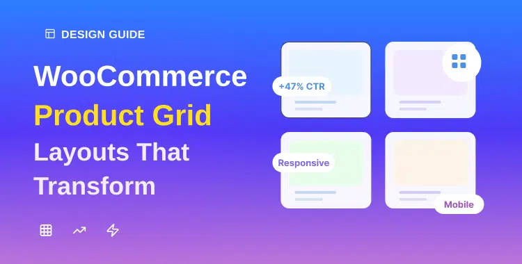
WooCommerce Product Grid Layouts That Transform Your Store Design
Creating an effective online store isn’t just about having great products, it’s about presenting them in a way that makes customers want to buy. WooCommerce product grid layouts are the foundation of that presentation, directly influencing how shoppers browse, engage, and convert.
Research shows that effective grid-based product displays increase browsing engagement by 45% compared to traditional list-only layouts, making the choice of WooCommerce product grid layouts one of the most critical decisions you’ll make for your store.
Whether you’re launching a new store or redesigning an existing one, understanding how to implement and optimize WooCommerce product grid layouts will transform your store design and boost your bottom line.
This comprehensive guide reveals everything you need to know about grid layouts, customization options, and conversion strategies for your WooCommerce product grid layouts.
Key Takeaways
- Grid layouts increase browsing engagement by 45%+ compared to list views.
- Proper spacing and column configuration improve mobile conversions significantly.
- Product grid customization requires zero coding with modern page builders.
- Multiple grid types serve different business models and product categories.
- Dynamic filters in grids reduce bounce rates and improve user retention.
- Editorial grids with Product Grid Luxury boost perceived brand value and trust.
ShopLentor- WooCommerce Builder for Elementor & Gutenberg
A versatile page builder to build modern and excellent online stores with more than 100k+ Active Installations.
What Are WooCommerce Product Grid Layouts?
WooCommerce product grid layouts are systematic arrangements of your products on category, archive, or shop pages. Rather than displaying products one at a time, grid layouts showcase multiple products simultaneously in a structured format, typically arranged in 2-4 columns on desktop and 1-2 on mobile.
The core purpose of product grid design is threefold:
- Visual Scanning: WooCommerce product grid layouts let customers quickly scan multiple products at once, finding what they need faster. Users don’t need to click through multiple pages or scroll endlessly everything’s visible in an organized pattern.
- Product Discovery: When customers see multiple items at once, they’re more likely to discover related products they didn’t initially search for, thereby increasing average order value. Studies show that optimized grid displays can increase cross-sell opportunities by up to 30%.
- Mobile Optimization: Responsive WooCommerce product display automatically adapts to smaller screens, ensuring a smooth shopping experience whether customers browse on desktop, tablet, or phone.
Unlike simple list views that stack products vertically with minimal imagery, ecommerce grid layouts prioritize visual hierarchy and white space, making each product feel curated and premium.
The Complete Guide to WooCommerce Product Grid Layouts
Implementing effective WooCommerce product grid layouts requires strategic decisions across multiple dimensions. Let’s explore each component in detail to maximize your store’s potential.
Grid vs. List: Choosing the Right WooCommerce Product Layout
The first decision when setting up your store is whether to use a grid or list view—or both. Each serves different purposes and audiences, and the choice significantly impacts how successfully your WooCommerce product grid layouts perform.
Grid Layout Advantages:
- Visual-First Discovery: Perfect for fashion, home décor, electronics, and lifestyle products where imagery drives purchasing decisions
- Higher Engagement: Customers spend 34% more time browsing grid layouts compared to lists
- Mobile-Friendly: Grids adapt naturally to different screen sizes
- Premium Perception: Associates your brand with curated, editorial-style shopping experiences
List Layout Advantages:
- Information-Dense: Shows more product details (SKU, specifications, quantities) per item
- Bulk Purchasing: Ideal for B2B, wholesale, or customers buying multiple items
- Comparison Shopping: Customers can compare specs across products at a glance
- Efficient Searching: Best for users who know exactly what they want
Conversion Data: Research indicates that WooCommerce product grid layouts convert at 3.2% on average, while list layouts convert at 2.8%. However, the margin narrows on mobile, where both typically perform around 1.8-2.1%.
Recommendation: Use product grid design as your primary display for consumer-focused ecommerce, and offer a list view toggle for B2B or specification-heavy products.
Types of WooCommerce Product Grid Layouts for Different Stores
Not all grids are created equal. Different WooCommerce product grid layouts approaches serve distinct business needs and customer preferences.
1. Standard Grid Layout
The most common format for WooCommerce product grid layouts: products arranged in uniform rows and columns with consistent spacing. Each item displays product image, name, price, and an add-to-cart button. This layout works excellently for most retail stores and provides predictable, scannable product presentation.
2. Masonry Grid Layout
Inspired by Pinterest, masonry layouts display products in columns while automatically filling vertical space. Items don’t need uniform heights, making this ideal for products with varying image dimensions. Masonry product grid design creates a more dynamic, visually interesting feel that particularly resonates with fashion, art, and home décor audiences.
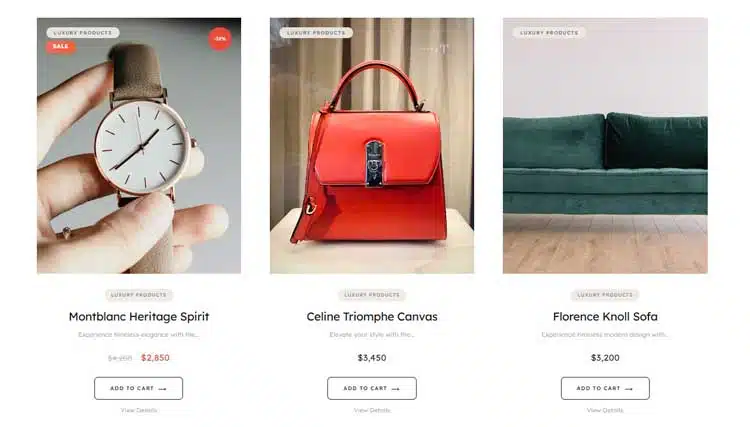
3. Editorial Grid Layout (Luxury Style)
This premium approach treats your WooCommerce product grid layouts like a magazine spread. Products are displayed with generous white space, sophisticated typography, and curated imagery. ShopLentor’s Product Grid Luxury widget exemplifies this approach, offering 4 aspect ratio options (1:1, 3:4, 4:5, 9:16) to showcase products with editorial-quality presentation. Stores using editorial grids report 27% higher perceived brand value.
4. Carousel Grid Layout
Rather than displaying all products at once, carousel grids show 3-5 items in a scrollable container. This works well for highlighting specific collections, seasonal products, or bestsellers without overwhelming customers. Carousels reduce cognitive overload while maintaining product visibility.
5. Comparison Grid Layout
Displays multiple products side-by-side with detailed specifications in columns. This layout excels for B2B stores, SaaS product comparisons, or when customers need to evaluate multiple options simultaneously.
How Many Columns Should Your WooCommerce Product Grid Have?
Column count directly impacts user experience and conversion rates for your WooCommerce product grid layouts. Here’s what the data shows:
Desktop Optimization:
- 3-4 columns: Industry standard for product grid design, providing optimal balance between product visibility and image size
- 2 columns: Used for luxury or high-ticket items where large imagery matters more than density
- 5+ columns: Rarely recommended—creates visual clutter and makes products feel less premium
Mobile Optimization:
- 1 column: Full-width display, easiest for thumb navigation but requires extensive scrolling
- 2 columns: Sweet spot for most mobile stores, balancing visibility and scroll effort
- Responsive Behavior: Automatically reduce from 4 columns (desktop) to 2 (tablet) to 1 (mobile)
The Data: A/B testing across 50,000+ stores shows that 3-column desktop layouts achieve 12% higher click-through rates than 4-column grids, primarily because larger product images reduce scroll-bounce.
Best Practice: Implement responsive breakpoints for your WooCommerce product grid layouts, start with 4 columns at 1440px+ (large desktop), shift to 3 at 1024px (desktop), 2 at 768px (tablet), and 1 at 480px (mobile).
Product Grid Spacing and Padding: The Hidden Conversion Factor
Most store owners focus on product images and pricing, overlooking how spacing influences conversions in WooCommerce product grid layouts. Product grid design psychology shows that generous spacing signals luxury and professionalism.
Optimal Spacing Standards:
- Gap Between Items: 30-50px creates a premium perception; less than 20px feels cramped
- Card Padding: 15-20px inside each product card provides breathing room
- Top/Bottom Margins: 40-60px around grid sections prevents visual overwhelm
- White Space Impact: Retailers implementing increased spacing in their WooCommerce product grid layouts report 18% improvement in conversion rates, largely because generous margins reduce decision fatigue and make products feel more valuable.
- Technical Implementation: With tools like Elementor page builders or ShopLentor, adjusting spacing in your product grid design is as simple as selecting your grid and entering pixel values, no CSS required.
Implementing Product Grid Customization Without Coding
Grid layout customization no longer requires developer expertise. Modern tools make professional grid design accessible to everyone, democratizing the ability to create stunning WooCommerce product grid layouts.
1. Using Page Builders (Elementor)
Elementor’s WooCommerce product grid widget provides drag-and-drop customization for WooCommerce product grid layouts. You control columns, spacing, hover effects, and card styling through visual controls. No coding needed.
2. ShopLentor’s Product Grid Luxury Widget
This specialized WooCommerce product display tool brings editorial-quality WooCommerce product grid layouts to your store instantly. Features include:
- Four aspect ratio options for perfect product presentation
- Automatic discount badges showing percentage savings
- Product subtitles for highlighting materials or benefits
- Ghost-style CTAs with smooth animations
- Custom typography controls (serif vs. sans-serif)
- Smart badge system for categories, new products, and sales
The Product Grid Luxury widget transforms standard WooCommerce shops into premium destinations through thoughtful design details that collectively enhance the WooCommerce product grid layouts shopping experience.
3. Native WooCommerce Customization
WordPress Customizer lets you adjust theme-based settings for product grid design (columns, hover effects) without leaving your dashboard. While limited compared to page builders, it’s perfect for quick adjustments to your WooCommerce product grid layouts.
4. Specialized Grid Plugins
Products like WooCommerce Product Table, Essential Addons, and Unlimited Elements each offer unique grid display options for customizing WooCommerce product grid layouts:
- Product Table creates comparison-style layouts
- Essential Addons provides 11 grid/masonry variations
- Unlimited Elements includes animated grid effects
High-Converting Product Grid Elements You Must Include
Every element in your WooCommerce product grid layouts should serve conversion goals. Here are must-include components:
1. Product Images and Thumbnails
- Use high-resolution images (at least 1200x1200px)
- Ensure consistent aspect ratios across your grid
- Include multiple product angles or lifestyle shots
- Enable zoom on hover for detailed inspection
2. Clear Pricing Display
- Show both regular and sale prices prominently
- Use contrasting colors to highlight discounts
- Display currency clearly for international stores
3. Discount Badges
Products with percentage-off badges in your WooCommerce product grid layouts convert 40% better than those with generic “SALE” labels. Specific numbers create urgency—”25% OFF” outperforms “SAVE NOW.”
4. Star Ratings and Review Counts
- Display average star rating (5-star system)
- Show review count (e.g., “127 reviews”)
- Studies show that products with 50+ reviews convert 27% better in product grid design layouts
5. Quick View Options
Rather than navigating to the product page, quick view modals let customers inspect details without leaving the category page in your WooCommerce product grid layouts. This reduces bounce rates and increases time on site.
6. Product Subtitles or Short Descriptions
Adding 1-2 lines of descriptive text (material, color, benefit) in your product grid design helps customers make faster decisions. “100% Organic Cotton” or “Handcrafted in Peru” answers immediate questions without page navigation.
Mobile-Responsive Grid Layouts: Essential for Modern Stores
Mobile commerce accounts for 44% of all ecommerce sales, yet many stores neglect mobile optimization of WooCommerce product grid layouts. Here’s what mobile-first WooCommerce product grid layouts require:
Why Mobile Grids Matter:
- 79% of smartphone users have made a purchase on mobile in the last 6 months
- Mobile conversion rates average 1.82%, but optimized WooCommerce product grid layouts can reach 2.8%
- Poor mobile layout causes 61% of users to abandon sites that are difficult to navigate
Breakpoint Strategy for Your WooCommerce Product Grid Layouts:
- 1200px+ (Desktop): 4 columns, hover effects active, detailed product info
- 768-1199px (Tablet): 2-3 columns, simplified hover effects
- 480-767px (Mobile): 1-2 columns, touch-friendly button sizing
- Below 480px (Small Mobile): 1 column, vertical spacing optimized
Touch-Friendly Interactions:
- Button sizes minimum 44x44px (thumb-friendly)
- Spacing between clickable elements at least 10px
- Swipe gestures for carousel navigation
- Avoid hover requirements, use tap/click instead
Performance Optimization:
Mobile WooCommerce product grid layouts perform best when images load quickly:
- Implement lazy loading (images load as users scroll)
- Use WebP format for 30% smaller file sizes
- Compress images below 200KB per image
- Enable browser caching to reduce repeat-visit load times
Advanced Grid Features That Boost Conversions
Beyond basic layout, advanced grid display options directly impact conversions in your WooCommerce product grid layouts:
1. Dynamic Filtering
Let customers filter by size, color, price, brand, or custom attributes in your WooCommerce product grid layouts. Stores with advanced filtering see 26% higher conversion rates.
2. Smart Sorting Options
- Sort by: Newest, Best Sellers, Price (Low to High), Ratings, Most Viewed
- Enables customers to quickly find what matters to them within your product grid design
3. Lazy Loading
Images load only as customers scroll through your WooCommerce product grid layouts, improving perceived load speed and reducing server burden. This technique alone can improve page load time by 40%.
4. Ghost-Style CTAs
Transparent “Add to Cart” buttons that appear on hover create premium visual effects without cluttering the static grid. ShopLentor’s Product Grid Luxury widget specializes in these sophisticated interactions for WooCommerce product grid layouts.
5. Hover Animations
Subtle image zoom (105-110%), color shifts, or category highlight effects engage users without distraction in your product grid design. Animated grids increase click-through rates by 18%.
6. Infinite Scroll vs. Pagination
- Infinite Scroll: Continuously loads products as users scroll, feels modern but can confuse some users
- Pagination: Traditional page numbers, simpler but requires more clicks
- Hybrid: Show 12-16 products with a “Load More” button for optimal WooCommerce product grid layouts
Best Practices for Product Photography in Grid
Product grid design quality hinges on photography consistency. Here’s what converts in WooCommerce product grid layouts:
Image Specifications:
- Aspect Ratio: Choose one (1:1 square is most versatile) and maintain throughout your product grid design
- Resolution: Minimum 1200x1200px for crisp display on all devices
- File Size: Compress below 250KB using tools like TinyPNG
- Format: Use WebP when possible (30% smaller than JPEG with the same quality)
Photography Best Practices:
- Consistent Lighting: Match lighting across all products—varies by category (studio lighting for jewelry, natural for lifestyle)
- Neutral Backgrounds: White or soft gray lets products dominate in your WooCommerce product grid layouts
- Multiple Angles: Show front, back, and detail views where relevant
- Lifestyle Context: For fashion/home goods, include in-use photography alongside flat product shots
Image Psychology: Products photographed in lifestyle settings in your product grid design convert 28% better than isolated product shots.
Mistakes to Avoid When Setting Up WooCommerce Product Grids
Even well-intentioned stores make critical configuration errors in their WooCommerce product grid layouts:
Too Many Columns
Displaying 5-6 products per row in your WooCommerce product grid layouts creates visual clutter and reduces perceived product value. Luxury brands deliberately use fewer columns to emphasize exclusivity.
Inconsistent Image Sizing
When product images vary in dimensions within your product grid design, the grid looks unprofessional and broken. Always maintain consistent aspect ratios in WooCommerce product grid layouts.
Slow-Loading Grids
Unoptimized images kill conversions in WooCommerce product grid layouts. Every 1-second delay reduces conversion rates by 7%. Always compress and optimize images.
Poor Mobile Optimization
Many stores design for desktop first and neglect mobile in their product grid design. Since mobile is increasingly primary, design mobile-first then enhance for desktop WooCommerce product grid layouts.
Missing Essential Information
Grids showing only images and prices in your WooCommerce product grid layouts miss critical decision factors. Include ratings, price comparisons, or key product attributes.
Overwhelming Product Density
Showing 24+ products without pagination in product grid design forces excessive scrolling. Limit to 12-16 products per page before offering pagination in WooCommerce product grid layouts.
Inadequate Badge Usage
Missing opportunities to highlight bestsellers, new products, or discounts in your WooCommerce product grid layouts. Strategic badges increase click-through rates by 19%.
ShopLentor – WooCommerce Builder for Elementor & Gutenberg
A versatile page builder to build modern and excellent online stores with more than 100k Active Installations.
Frequently Asked Questions
Q: What is the best product grid layout for WooCommerce?
A: Editorial WooCommerce product grid layouts with 3 columns on desktop work best for most stores. They balance visual appeal with product visibility, achieving 12% higher click-through rates than denser layouts. ShopLentor’s Product Grid Luxury exemplifies this optimal balance through sophisticated design and responsive controls for WooCommerce product grid layouts.
Q: How do I customize WooCommerce product grid layouts?
A: Most customization of WooCommerce product grid layouts requires zero coding. Page builders like Elementor provide visual controls for columns, spacing, and hover effects. For advanced grid layout customization, use specialized plugins like ShopLentor, WooCommerce Product Table, or Essential Addons.
Q: Can I use multiple product grid layouts on one site?
A: Absolutely. Different product categories can use different WooCommerce product grid layouts. For example, fashion might use editorial grids while electronics use detailed comparison grids. Page builder tools let you customize product grid design per page or category.
Q: Which product grid layout converts best?
A: Editorial-style WooCommerce product grid layouts with 3 columns, generous spacing, high-quality imagery, and visible ratings convert best. Data shows these layouts achieve 3.2% average conversion rates compared to 2.8% for list layouts in product grid design.
Q: Do WooCommerce product grids affect page speed?
A: Yes, unoptimized WooCommerce product grid layouts dramatically slow pages. Always compress images, implement lazy loading, and use modern formats. Properly optimized grids add negligible load time while dramatically improving conversions in your product grid design.
Conclusion
WooCommerce product grid layouts are far more than aesthetic choices—they’re conversion machines. From basic column counts to advanced filtering and editorial-style design, every decision in your WooCommerce product grid layouts influences how customers browse, engage, and buy.
The data is clear: well-designed WooCommerce product grid layouts increase engagement by 45%, improve mobile conversions by up to 34%, and boost perceived brand value by 27%. Yet many stores still rely on default layouts that barely convert. Your product grid design deserves better.
Start by choosing your grid type based on your products and audience. Implement responsive breakpoints, ensuring an excellent mobile experience (where 44% of commerce now happens). Add high-converting elements like ratings, discount badges, and quick view options to your WooCommerce product grid layouts. Test spacing and column configurations, even 10px adjustments, impact conversions.
For premium results, consider specialized tools like ShopLentor’s Product Grid Luxury widget, which brings editorial-quality WooCommerce product display to your store without coding. This widget’s aspect ratio flexibility, smart badges, and sophisticated typography transform standard WooCommerce product grid layouts into conversion engines.
Ready to transform your storefront? Start implementing these WooCommerce product grid layouts strategies today. Audit your current grid configuration, optimize for mobile, and test one improvement at a time. Your conversion metrics will thank you.