7 Email UX Design Best Practices and Template Examples
Email is a marketing powerhouse.
Did you know that a whopping 87% of marketers say email is crucial to their success? And that’s not all. A significant 41% admit that it’s the most effective marketing channel.
But with so many messages landing in customers’ inboxes every day (around 100 to 120 emails daily), it can be hard to stand out.
When it comes to creating a successful email marketing campaign, it’s not just the content that matters. The user experience (UX) design also plays a significant role.
When you nail the UX design, subscribers will find your emails a joy to interact with. Email marketers must follow the latest email UX best practices to ensure higher engagement rates effectively.
In this comprehensive guide, we’ll explore proven email UX design best practices for 2024-2025, including mobile-first responsive design, email personalization strategies, interactive email elements, and accessibility optimization to help you create emails that convert.
With that in mind, let’s look at 7 email UX design practices and some examples to inspire your email campaigns.
- What is Email UX Design?
- Email UX Design Best Practices to Inspire Your Campaigns
- Know Your Target Audience
- Email Personalization
- Use Clear CTAs
- Use Responsive Email Designs
- Interactive Email Design
- Use a Scannable Email Layout to Improve Readability
- Use Attractive Images
- Email Template Examples To Inspire Your Email Marketing Campaigns
- 1. Anya Hindmarch’s Product Promotion Email
- 2. Section’s Newsletter
- 3. Crocs’ Order Confirmation Email
- 4. LinkedIn’s Personalized Email
- Best Email Design Tools for 2024-2025
- Frequently Asked Questions
- Final Thoughts
What is Email UX Design?
Simply put, email UX (user experience) refers to the experience customers have while interacting with your emails.
Therefore, UX design means optimizing the elements of your email, like images, subject lines, and call-to-action (CTA) buttons, so you can offer recipients the best possible experience. That way, customers can find value in your content and quickly take the desired action.
Email UX design encompasses everything from mobile responsiveness and accessibility to personalization and interactive elements.
A well-designed email UX considers how recipients scan, read, and engage with your content across different devices and email clients, ensuring a seamless experience that drives conversions.
Email UX Design Best Practices to Inspire Your Campaigns
Let’s now look at seven email UX design best practices to implement in your email marketing campaigns in 2024-2025:
Know Your Target Audience
Understanding your target customers will help you tailor your messages to resonate with them and boost engagement. Therefore, you need to know their needs, interests, and pain points.
One way to know this is to create customer profiles or buyer personas that help you visualize your target audience, and then send emails that speak directly to their preferences and needs.
For example, suppose you’re selling skateboards. If your target audience is teenagers, you can use fun words and maybe fantastic images to engage them.
But if you’re interacting with parents buying skateboards for their kids, you might focus on safety and reasonable prices.
Beyond demographics, consider psychographic data such as values, lifestyle preferences, and buying behaviors.
Use email marketing platforms with segmentation features to create dynamic audience groups based on engagement history, purchase patterns, and browsing behavior.
This data-driven approach to audience understanding enables more precise personalization and improves email marketing ROI.
Email Personalization
Email personalization is one of the most powerful strategies for improving engagement and conversion rates.
While you may know about adding a recipient’s name to the subject line, effective email personalization in 2024-2025 goes far beyond basic name insertion.
Why Email Personalization Matters
According to recent research, personalized emails achieve an impressive open rate of almost 30%, compared to generic emails.
Additionally, 70% of consumers expect personalization and get annoyed when it doesn’t happen. Personalized subject lines alone can increase open rates by 20-30%, making this a critical component of email UX design.
Types of Email Personalization to Implement:
1. Dynamic Content Personalization
Instead of just using names, leverage customer data to personalize entire content blocks based on:
- Purchase history and browsing behavior
- Geographic location and local events
- Past engagement with previous emails
- Customer lifecycle stage (new subscriber, loyal customer, at-risk account)
2. Segmented Email Campaigns
Create specific email segments for different audience groups:
- New subscribers: Welcome series with educational content
- Active customers: Product recommendations and exclusive offers
- Inactive subscribers: Re-engagement campaigns with special incentives
3. AI-Driven Personalization
Modern email marketing platforms now use artificial intelligence to:
- Generate personalized subject lines that resonate with individual recipients
- Optimize send times based on when each recipient is most likely to open
- Recommend products based on browsing and purchase patterns
- Adjust email content dynamically based on recipient preferences
AI subject line generators like Phrasee, SendX, and Copy.ai analyze millions of data points to create subject lines that drive higher open rates.
4. Behavioral Trigger Emails
Set up automated emails triggered by specific user actions:
- Abandoned cart reminders with personalized product images
- Browse abandonment emails featuring recently viewed items
- Milestone celebrations (birthday, anniversary, loyalty program achievements)
Personalization Best Practices:
- Test different personalization variables to see what resonates.
- Balance personalization with privacy, don’t be creepy.
- Ensure data accuracy to avoid embarrassing mistakes.
- Combine personalization with strong UX design for maximum impact.
Use Clear CTAs
A clear call to action (CTA) helps readers know what to do next. Think of it like a signpost. If it’s easy to see, people will know where to go. But if it’s hidden or confusing, they might get lost. As a result, having a clear CTA can lead to higher clickthroughs and more conversions.
Here are some tips to make your CTAs clear:
- Keep it short: Use a few words like “Shop Now” or “Read More.”
- Be direct: Tell customers precisely what you want them to do.
Advanced CTA Optimization Strategies for 2024-2025:
1. CTA Button Placement and Hierarchy
- Primary CTA: Place above the fold for immediate visibility
- Secondary CTA: Include near the bottom for those who scroll
- Multiple CTAs: Use the same action (consistency drives conversions)
2. CTA Button Color Psychology
- Orange/Red: Creates urgency and excitement (highest conversion for sales)
- Green: Suggests “go” and positive action (great for sign-ups)
- Blue: Builds trust (ideal for B2B and professional services)
3. Actionable CTA Copy
Instead of generic phrases, use specific, value-driven anchor text:
- Generic: “Click Here” → Better: “Get My Free Template”
- Generic: “Learn More” → Better: “Discover 10 Design Secrets”
- Generic: “Shop Now” → Better: “Claim 30% Off Today”
4. CTA Analytics and Testing
- Track click-through rates for each CTA placement
- Use heatmaps to see where users actually click
- Test single CTA vs. multiple CTAs to optimize conversion
Use Responsive Email Designs
Almost half (41.9%) of people use their mobile devices to open emails. And seven in ten users will delete an email that doesn’t display correctly on their phone.
That’s why you must use responsive email templates when crafting your emails. A responsive design can increase click-through rates since it smoothens the user experience.
Because of that, 22% of email marketers want to implement new email design systems in the next 12 months, according to the Litmus State of Email Workflows 2024 Report.
However, the mobile email landscape has evolved dramatically. More recent 2024-2025 data shows that 71.5% of consumers now primarily use mobile phones to view emails, with less than 25% primarily using computers.
This represents a significant shift toward mobile-first email consumption and underscores why responsive design is no longer optional, it’s essential.
The best way to create responsive email designs is to use email marketing software like Sender, which offers a library of prebuilt email templates and a drag-and-drop email editor.
Once you craft your email, you can preview it to check its mobile responsiveness before hitting the send button.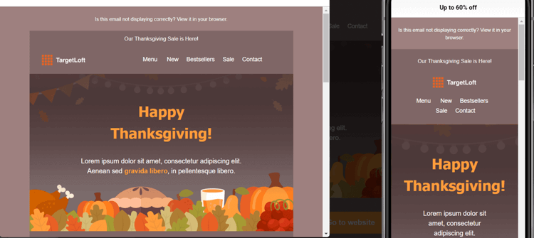
If you have a WooCommerce store, you can use Email Candy Pro to customize the default WooCommerce email templates and give your emails a professional look.
Additionally, more recent 2024-2025 data shows that 71.5% of consumers primarily use mobile phones to view emails, with less than 25% primarily using computers.
This represents a significant increase from the 41.9% statistic and demonstrates the critical importance of mobile-first design strategies
Interactive Email Design
While static emails have been the standard for years, interactive email design is revolutionizing email marketing in 2024-2025. Interactive elements transform passive reading into active engagement, significantly boosting click-through rates and conversions.
Why Interactive Emails Work
Research shows that interactive emails can increase click-through rates by up to 70%. Even more impressive, AMP for Email (Accelerated Mobile Pages) can increase conversions by 500%.
Additionally, 91% of consumers want to receive interactive emails, and 60%+ engage more deeply with interactive content compared to static emails.
Types of Interactive Email Elements:
- Email Carousels and Image Galleries
- Interactive Polls and Surveys
- Gamification Elements
- AMP for Email Capabilities
- Hover Effects and Micro-Animations
Tools for Creating Interactive Emails:
- Stripo: Drag-and-drop editor with built-in interactive elements
- Mailmodo: AMP email builder with no-code interface
- Email on Acid: Interactive email testing and validation
- Litmus: Interactive email capabilities and previews
Use a Scannable Email Layout to Improve Readability
How do you typically read emails that land in your inbox? Do you carefully read every word or scan the email for details that interest you?
Only a few people will read an entire email. Most recipients just skim the content and only read it more in-depth if they find something interesting.
Based on research by the Nielsen Norman Group, the average amount of time people spend on an email campaign after opening it is 51 seconds. So you have very little time to get their attention.
The best way to structure your email to appeal to scanners is to use elements like images and headlines to capture their attention and get them to read the body copy in more detail.
Here are some ways to make that happen:
- Break your email into chunks. Instead of having one big block of text (which can be hard to understand), break it into smaller, easier-to-read paragraphs.
- Use white space to help you focus on the essential parts of your email while making it neat and easy to read.
- Put the most important and urgent message at the top of your email to help people remember it.
- Use appropriate word and line spacing to make your content easy to scan and keep subscribers engaged.
Use Attractive Images
Images help engage customers when they open your messages. They also break up large blocks of text and allow you to convey details about your products.
When using pictures, stay on-brand and use the right visuals. An image that doesn’t fit your brand style can take away from your message and distract your audience.
For example, suppose you send an email with a discount offer on a particular item. In that case, you can simply add an image of the product and its description. This immediately tells the recipient, “Here’s the item on offer and some of its features.”
Here’s a good example from Terrasoul: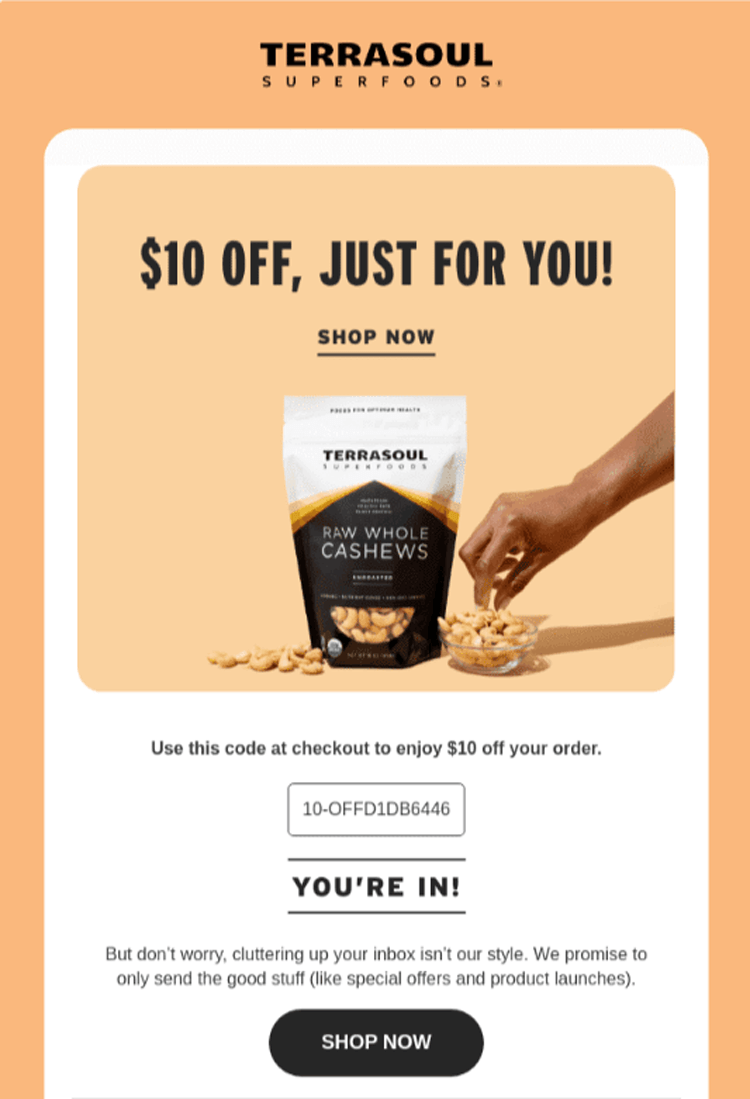
Terrasoul’s email design is straightforward but effective. It has a high-quality product image, a discount offer in a big font size, and a CTA button that leads to the checkout page.
Also, consider including a descriptive alt text to help visually impaired users who use screen readers understand your photos’ content. Without alt text, they may miss out on important details.
In addition, many email clients block images by default to protect users from potentially harmful content.
If your pictures have crucial information and don’t load, your email recipients may miss important details. That’s why you should always add descriptive alt text to every image.
Email Template Examples To Inspire Your Email Marketing Campaigns
Let’s now look at some email examples that illustrate good UX design best practices.
1. Anya Hindmarch’s Product Promotion Email
Marketers use promotional emails to promote their products or services. These emails often include discounts, special offers, and other promotional materials to entice customers to open the email and purchase the product.
Here’s a product promotion email from Anya Hindmarch that offers customers a good experience.
Subject line: Discover our bestsellers.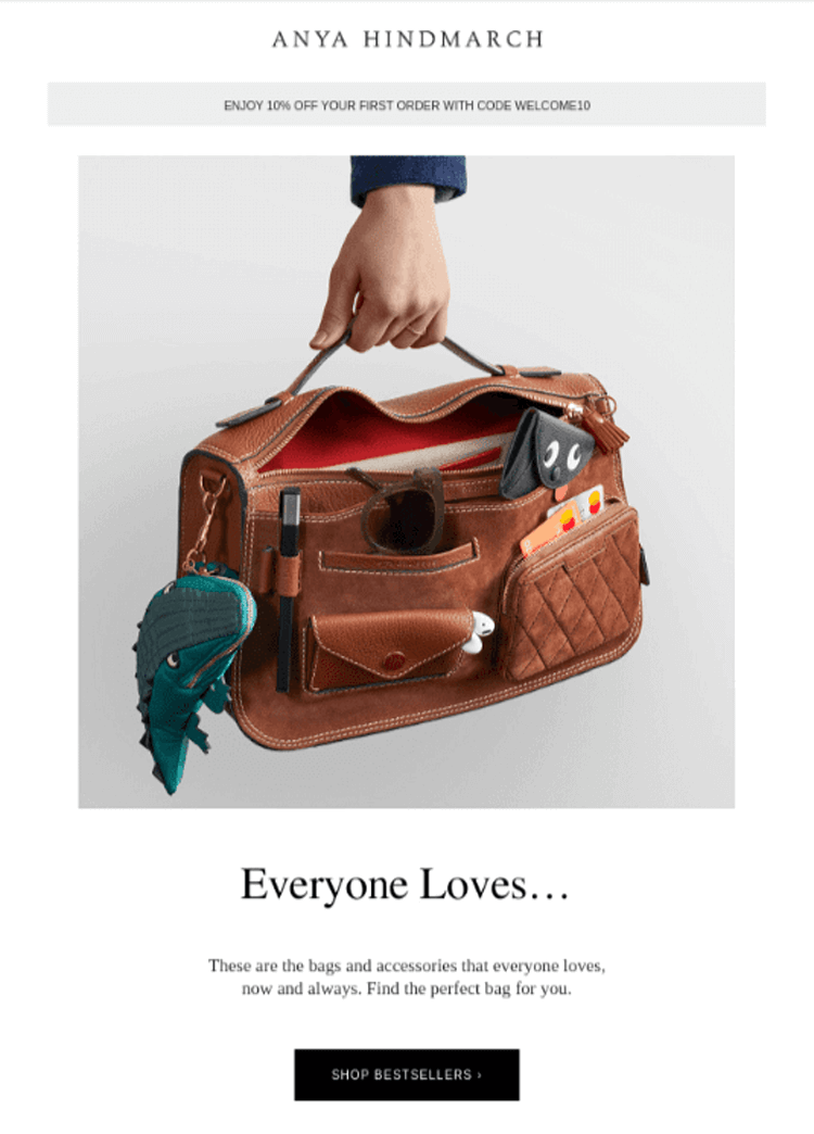
What we love about the email:
- The subject line is clear and uses an action verb: ‘discover’. This adds curiosity, making it more likely to be opened.
- White space is well used, making the email easy to read and understand.
- The email has high-quality product images, which make it visually appealing.
- It uses the Anya Hindmarch brand style throughout to create a consistent look.
2. Section’s Newsletter
Unlike a product promotion email that almost hypnotizes you to buy an item, newsletters focus on giving you free, valuable content.
When you consistently share with subscribers relevant content like news, articles, and updates that keep them informed, they’ll be more willing to open your emails. And they’ll be less likely to ignore your promotional emails.
Let’s look at a good Newsletter example from the Section.
Subject line: 5 courses our students call “mandatory”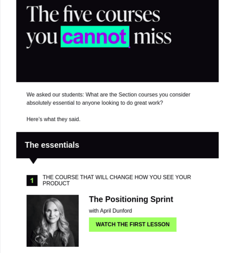
What we love about the email:
- The content is clear and uses a font that’s easy on the eyes.
- The colors complement each other.
- White space is well used, making it easy to read the text and pictures.
- The email maintains the Section’s brand style and colors.
3. Crocs’ Order Confirmation Email
Order confirmation emails are messages you send customers once they complete a transaction to keep them in the loop. They typically contain the shopper’s order confirmation details, such as the purchase total, the estimated delivery date, and what they bought.
Here’s an excellent example from Crocs:
Subject line: We got your order. (You have great taste!)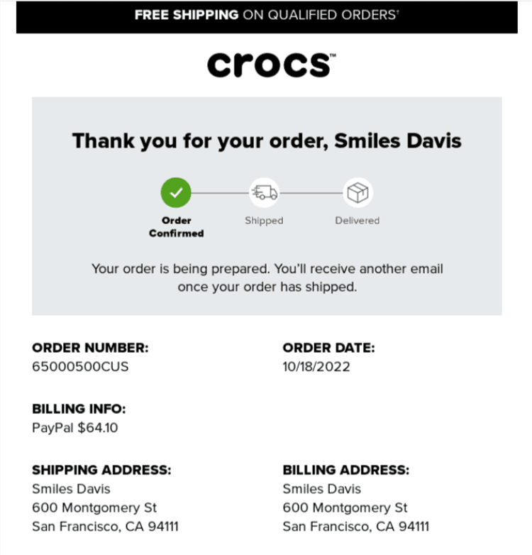
What we love about the email:
- The email is straightforward, with vital information such as order number, order date, and shipping address prominently displayed.
- The email has a scannable layout and clear fonts, making it easy to skim.
4. LinkedIn’s Personalized Email
Email personalization is when you use customer data to create unique emails for each individual on your email list. It’s an effective way to connect one-on-one with each subscriber to boost engagement.
Here’s a highly personalized email from LinkedIn.
Subject line: Hit your next posting milestone (it’s close)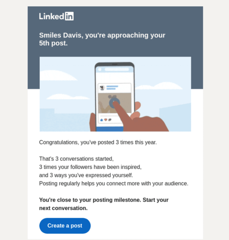
What we love about the email:
- The email is highly personalized to the user, with their conversations, followers, and milestones clearly visible.
- The LinkedIn logo and branding are used throughout the email, which gives it a consistent and professional look.
- The email is simple with vibrant colors.
Best Email Design Tools for 2024-2025
Creating professional, responsive, and accessible emails requires the right tools. Here are the best email design platforms and tools to streamline your workflow in 2024-2025:
Email Marketing Platforms with Built-In Design Tools:
1. Mailchimp
- Drag-and-drop email builder with 100+ templates
- Mobile preview and testing built in.
- AI-powered subject line helper
Best for: Small businesses and beginners
2. Klaviyo
- Advanced segmentation and personalization
- Pre-built e-commerce templates
- A/B testing and analytics
Best for: E-commerce brands
3. HubSpot
- Professional email templates with CRM integration
- Smart content personalization
- Comprehensive marketing automation
Best for: B2B companies and marketing teams
4. Sender
- Free plan with 15,000 emails/month
- Responsive template library
- Drag-and-drop editor with preview
Best for: Budget-conscious marketers
5. Beehiiv
- Clean, minimalist templates
- Built-in monetization features
Best for: Newsletter creators and content publishers
Email Template Customization Tools:
6. Email Candy Pro
- Customizes WooCommerce email templates
- Professional designs for order confirmations, shipping notifications
- Drag-and-drop WooCommerce email builder
Best for: WooCommerce store owners
7. Stripo
- Collaborative email design tool
- 600+ pre-designed templates
- Interactive elements and AMP support
- Export to any ESP
Best for: Design teams and agencies
AI-Powered Email Tools:
8. Phrasee
- AI-generated subject lines and email copy
- Learns your brand voice
- Predicts which language will perform best
- Best for: Large-scale email campaigns
9. Copy.ai
- AI email copywriting assistant
- Generates subject lines, body copy, CTAs
- Templates for different email types
- Best for: Marketers who need copy inspiration
Email Testing and Accessibility Tools:
10. Email on Acid
- Preview emails across 90+ clients and devices
- Accessibility testing and validation
- Spam testing and deliverability checks
- Best for: Quality assurance and testing
11. Litmus
- Email rendering tests across devices
- Spam filter testing
- Email analytics and engagement tracking
- Best for: Enterprise email teams
Alt Text and Accessibility Generators:
12. AltTextaii
- AI-powered alt text generation
- Describes images accurately
- Chrome extension for easy use
13. Ahrefs Image Alt Text Tool
- SEO-optimized alt text
- Contextual image descriptions
How to Choose the Right Email Design Tool:
- Features needed: Basic templates vs. advanced personalization
- Integration: Does it connect with your CRM, e-commerce platform?
- Ease of use: Drag-and-drop vs. code-based
- Testing capabilities: Built-in preview and testing
- Support and resources: Documentation, tutorials, customer service
Frequently Asked Questions
What is UI in email?
In email, the UI (or user interface) is the layout and visual elements that users interact with. It includes the images, text, buttons, links, and other features people see and click on within the email. A well-designed email UI makes it easy to read and interact with the email and helps users quickly understand the message and take the desired action.
What is the difference between UI and UX in email?
UI refers to the buttons, screens, icons, toggles, and other visual elements you interact with when reading an email. In contrast, email UX is your whole experience with the email, including how you feel when interacting with it.
Why is responsive design important in emails?
Responsive designs ensure your emails look good on all screens, such as phones, tablets, and desktops. When this happens, people can engage easily with your emails, which makes them more likely to click links, increasing your click-through and conversion rates. With 71.5% of consumers now primarily viewing emails on mobile devices, responsive design is critical for reaching your audience effectively.
How do I make my emails more accessible?
o make emails accessible, follow these key practices: add descriptive alt text to all images, use proper heading hierarchy (H1, H2, H3), ensure color contrast meets WCAG standards (4.5:1 minimum), use descriptive link text instead of “click here,” maintain readable font sizes (14px minimum), and test with screen readers. Accessible emails benefit everyone and improve overall deliverability and engagement.
How can I improve my email click-through rates?
To improve email click-through rates: use clear, action-oriented CTAs with contrasting colors; personalize content based on recipient behavior; optimize for mobile since 71.5% of users view emails on phones; create scannable layouts with clear hierarchy; include interactive elements where appropriate; A/B test subject lines, CTAs, and design elements; and ensure your value proposition is immediately clear. Even small UX improvements can significantly impact CTR.
Final Thoughts
How your emails look can be the difference between a click and a quick delete. So, good email UX design isn’t just an option; it’s a must in 2024-2025.
Here’s a summary of the best email UX design practices you can apply to your campaigns to make your emails stand out:
- Know your target audience and create detailed buyer personas.
- Implement email personalization strategies using AI and behavioral data.
- Use clear CTAs with strategic placement and actionable copy
- Use responsive email designs with mobile-first approach (71.5% of users are on mobile).
- Create interactive email experiences to boost engagement by up to 70%.
- Use a scannable email layout to improve readability following F-pattern and Z-pattern principles.
- Use attractive images with proper alt text and optimization.
- Ensure email accessibility for all users with WCAG-compliant design.
Remember, every small change in design can lead to significant results. The email marketing landscape is evolving rapidly with AI personalization, interactive elements, and mobile-first design becoming standard expectations.
Continue to test and refine your email elements, stay updated on the latest email UX trends, and always prioritize your subscribers’ experience to drive engagement and grow your business.
By implementing these email UX design best practices for 2024-2025, you’ll create emails that not only look professional but also deliver exceptional user experiences that convert subscribers into loyal customers.