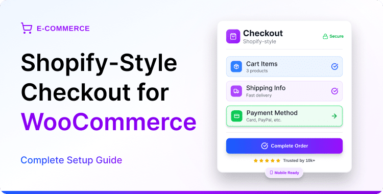
Shopify-Style Checkout for WooCommerce: Best Practices to Improve Mobile Conversions
Quick Answer
To improve mobile conversions with a Shopify-style checkout for WooCommerce, focus on these core practices: enable express payments (Apple Pay, Google Pay), capture email first, use a single-column layout, add a sticky CTA button, enable address autofill, and display trust signals near payment fields. A plugin like ShopLentor lets you implement all of this without writing a single line of code.
TL;DR
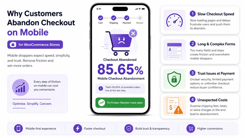
- Mobile cart abandonment sits at 85.65% — far higher than desktop (Baymard Institute, 2025)
- A Shopify-style checkout fixes the layout. But layout alone is not enough to convert mobile shoppers
- Express payments (Apple Pay, Google Pay) are the single highest-impact change for mobile conversions
- Each extra checkout step on mobile increases abandonment risk by approximately 5% (WiserReview, 2026)
- ShopLentor’s Shopify-style checkout module provides the foundation — the best practices in this guide complete the picture
About This Guide
This article is for WooCommerce store owners and CRO-focused marketers who have already set up or are considering a Shopify-style checkout. It focuses exclusively on mobile conversion optimization. It does not cover the initial plugin setup process.
New to the Shopify-style checkout? Start here first: How to Add a Shopify-Style Checkout in WooCommerce. This guide picks up where that one ends.
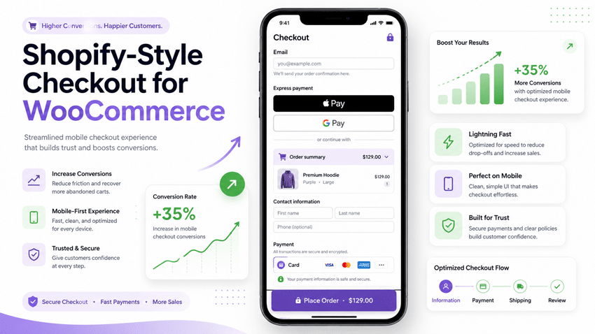
You have done the hard part. You have installed a Shopify-style checkout for WooCommerce store. The layout looks clean. The flow is streamlined. It looks the part.
But your mobile conversion rate is still lower than you expect.
You are not alone. This is one of the most common frustrations WooCommerce store owners face. A better-looking checkout does not automatically mean a better-converting checkout — especially on mobile.
Here is the reality: over 85% of mobile shoppers abandon their cart before completing a purchase (Baymard Institute, 2025). The layout is only one piece of the puzzle. The other pieces, where the email field sits, whether express payments are available, how fast the page loads, and whether shoppers feel safe entering their card details are what separate a checkout that looks good from one that actually converts.
This guide covers all of it. Ten practical, data-backed best practices that take your Shopify-style WooCommerce checkout from well-designed to genuinely high-converting on mobile.
Table of Contents
Why Mobile Checkout Optimization Matters More Than Ever
Most WooCommerce stores now receive more than 60% of their traffic from mobile devices. Yet mobile consistently converts at a fraction of desktop rates. The gap is not about product quality or pricing. It is about friction – small, compounding moments where the experience breaks down on a small screen.
Here is what the data tells us:
- 85.65% of mobile shoppers abandon their cart before completing a purchase (Baymard Institute / Geek Plugin, 2025)
- 25% of shoppers abandon checkout because they do not trust the site with their credit card information (Baymard Institute, 2025)
- 18% of shoppers leave because the checkout process is too long or complicated (Canada Create, 2025)
- 48% abandon when unexpected costs appear at the payment stage (Envisage Digital, 2025)
- Pages taking more than 3 seconds to load on mobile lose more than half their visitors before the form even appears (ShopLentor Abandoned Cart Study, 2026)
A Shopify-style checkout addresses layout and form flow. That is the foundation. What this guide covers is everything you build on top of that foundation to close the mobile conversion gap.
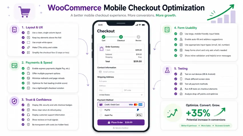
Best Practices to Improve Mobile Conversions
# 1: Enable Express Checkout Payments First
This is the single highest-impact change you can make for mobile conversions.
Express payments: Apple Pay, Google Pay, and WooPay, let shoppers complete a purchase in one or two taps. No typing card numbers. No entering billing addresses. No CVV code on a cramped mobile keyboard. Shoppers authenticate with Face ID or Touch ID, and the order is placed.
On mobile, typing is the biggest source of checkout friction. Express payment methods eliminate it entirely.
How to implement this:
- Enable Apple Pay and Google Pay through your payment gateway (WooPayments, Stripe, or Square)
- Display express payment buttons at the top of the checkout page — before any form fields
- Label buttons clearly: “Pay with Apple Pay” or “Fast checkout with Google Pay“
- Do not bury them at the bottom as an afterthought — they should be the first thing a mobile shopper sees
Note: Express checkout bypasses your full checkout form and uses payment details stored in the customer’s device wallet. If you collect custom checkout fields (order notes, VAT numbers), you will need a standard fallback flow for those customers.
ShopLentor’s Shopify-style checkout module is fully compatible with WooPayments and Stripe, both of which support Apple Pay and Google Pay out of the box.
# 2: Put the Email Field First
This is one of Shopify’s most proven checkout design decisions — and it works for a very specific reason.
Capturing email before any other field means you can trigger abandoned cart recovery emails even if the shopper never completes the purchase. On mobile, where distractions are higher and sessions are shorter, this matters enormously.
WooCommerce’s default checkout asks for email later in the billing address block. That ordering directly reduces your cart recovery rate. If someone fills in their name and address but leaves before entering their email, you have lost them permanently.
How to implement this:
- Move the email field to the very top of your checkout form — before name, address, or any other field
- Add a short reassurance line beneath the email field: “We’ll send your order confirmation here.”
- Set up a 3-email abandoned cart recovery sequence:
- Email 1: Within 1 hour of abandonment
- Email 2: 24 hours later
- Email 3: 72 hours later (consider including a small discount code)
ShopLentor’s Shopify-style checkout module places the email field first by default, matching Shopify’s proven checkout flow without any manual field reordering required.
Email-first checkout was pioneered by Shopify to maximize abandoned cart recovery. It is now considered an industry best practice for any eCommerce platform. The logic is simple: if you do not capture the email, you cannot recover the abandoned sale.
# 3: Use a Single-Column Layout on Mobile
Two-column checkout layouts look clean on desktop. On mobile, they break down.
Fields stack awkwardly. Buttons shift out of thumb reach. Users lose track of where they are in the process. A single-column layout solves all of this by giving every field its own full-width row.
The eye moves naturally from top to bottom. There is no horizontal scrolling, no misaligned labels, and no confusion about what to fill in next.
How to implement this:
- Ensure your checkout layout automatically switches to single-column on screens narrower than 768px
- Test on real physical devices — not just browser developer tools, which do not replicate real touch behavior
- Avoid floating labels that hide placeholder text once a user begins typing
- Set form field heights to a minimum of 48px — this is Google’s recommended minimum tap target size for touchscreens
Shopify’s checkout has always defaulted to single-column on mobile. ShopLentor replicates this layout behavior in WooCommerce automatically, without requiring any theme customization.
# 4: Add a Sticky “Continue” or “Place Order” Button
On mobile, the checkout CTA button often scrolls off-screen while a user fills in form fields. When they finish and look for where to proceed, the button is gone. They scroll. They get distracted. They leave.
A sticky CTA button stays anchored at the bottom of the screen at all times, regardless of scroll position. This sounds like a small detail. In practice, it removes a specific moment of friction that causes a real, measurable drop-off — particularly on longer checkout forms.
How to implement this:
- Make the primary CTA sticky on mobile viewports: “Continue to Shipping”, “Continue to Payment”, or “Place Order”, depending on the checkout step
- Use a high-contrast button color that stands out clearly against the form background
- Test specifically with the mobile keyboard open — ensure the sticky button does not overlap active input fields when the keyboard pushes content up
- Match button label to the current step — “Continue to Payment” is clearer and more action-oriented than a generic “Next”
A sticky checkout CTA ensures the primary action is always within thumb reach on mobile – removing the need to scroll back down and reducing the chance of the user losing their flow or exiting the page.
# 5: Enable Address Autofill and Smart Keyboard Inputs
Typing a full shipping address on a mobile keyboard is one of the most friction-heavy parts of any checkout. Every extra keystroke is a chance to make an error, get frustrated, and abandon.
Two features address this directly.
Address autocomplete connects to Google Places API (or a similar service) and auto-suggests complete addresses after the first few characters are typed. The shopper simply taps their address instead of typing it field by field.
Smart keyboard triggering ensures the right keyboard type opens automatically for each field:Field Type Expected Keyboard Phone number Numeric keypad Postcode / ZIP code Numeric keypad Card number Numeric keypad Email address Email keyboard (@ symbol visible by default) Name / Street address Standard QWERTY keyboard
This is controlled by the HTML inputmode attribute. Most modern WooCommerce checkout plugins handle this automatically, but it is worth verifying on a real iOS and Android device before publishing.
How to implement this:
- Enable address autocomplete in your checkout plugin settings (ShopLentor and most modern checkout plugins support this)
- Test every field type on real iOS and Android devices to confirm the correct keyboard opens
- Remove any form fields not essential to fulfilling the order — every unnecessary field adds friction and reduces completion rates
# 6: Display Trust Signals Near Payment Fields
Shoppers hesitate most at the payment step. This is where trust signals do their most important work, and where most stores place them in the wrong location.
On mobile, screen space is limited. You cannot add a large row of security badges below a lengthy privacy statement. You need the right signals in the right place — close to where the hesitation actually occurs.
The most effective trust signals for mobile checkout:
- SSL padlock icon placed directly next to or above the card input fields — not in the footer
- Payment method logos (Visa, Mastercard, PayPal, Stripe) are displayed just above or within the payment section
- A single short trust statement placed directly below the card number field: “256-bit SSL encryption, your data is safe”
- Satisfaction guarantee or return policy — one sentence only, positioned near the Place Order button
Research from the Baymard Institute consistently shows that 25% of shoppers abandon checkout specifically because they do not trust the site with their payment information (2025). A single well-placed trust badge near the card fields can recover a meaningful share of those lost sales.
What to avoid:
- Overloading the checkout page with too many different badges — this actually reduces trust by looking cluttered and unpolished
- Placing trust signals only in the page footer, where mobile shoppers rarely scroll to see them
- Using low-resolution or generic badge images that look unofficial
# 7: Show a Persistent, Collapsible Order Summary
On desktop, a two-column checkout layout keeps the order summary visible at all times while the shopper fills in the form. On mobile — with its single-column layout — the order summary disappears from view.
This creates a specific psychological problem. Shoppers cannot see what they are buying while they are completing the form. Doubt creeps in. They open a new browser tab to check the product page. They get distracted. They do not come back.
How to implement this:
- Display a collapsible order summary at the very top of the checkout page on mobile
- In the collapsed state, show: product thumbnail icon, product name, and total price
- Allow shoppers to tap to expand the full breakdown: itemized costs, shipping, taxes, discounts
- Ensure expanding or collapsing the summary does not reset or lose any form progress
Shopify’s checkout does this by default — the order summary collapses into a single tap-target row at the top of the mobile checkout page. ShopLentor’s Shopify-style checkout module replicates this exact pattern in WooCommerce.
# 8: Optimize Checkout Page Load Speed for Mobile
A checkout page that takes more than 3 seconds to load on mobile loses more than half of its visitors before the form even appears. This is one of the most overlooked causes of mobile checkout drop-off.
Speed at the checkout page is often different from speed across the rest of your site. Many stores run fast product pages but slow checkouts, caused by payment gateway scripts loading, third-party tracking pixels firing, or unnecessary plugins running at checkout when they are not needed there.
How to check your checkout speed:
- Copy your WooCommerce checkout page URL (e.g., https://yourstore.com/checkout)
- Go to Google PageSpeed Insights and paste the URL
- Select Mobile – not desktop – for the analysis
- Focus on Largest Contentful Paint (LCP) — this should be under 2.5 seconds on mobile
- Check the Opportunities section for specific scripts or resources slowing the page down
How to improve checkout page speed:
- Defer non-essential scripts (live chat widgets, analytics) so they do not block the initial checkout rendering
- Use WP Plugin Manager Pro to load specific plugins only on pages that need them — disabling heavy plugins on the checkout page removes overhead that has no benefit there (explore WP Plugin Manager Pro).
- Enable lazy loading for any product images displayed in the order summary
- Choose a lightweight payment gateway — some add significant script weight that can be avoided
WooCommerce checkout speed should always be tested on the checkout URL directly — not the homepage. Payment gateway scripts, SSL certificate validation, and form libraries add load weight that does not exist on other pages. A fast homepage does not mean a fast checkout.
# 9: Allow Cart Editing Directly at Checkout
This is one of the most underrated mobile UX improvements available to WooCommerce store owners.
On mobile, shoppers frequently reach the checkout page and realize they have selected the wrong size, wrong color, or wrong quantity. On most default WooCommerce stores, fixing this requires navigating back to the cart page. That backward navigation on mobile, especially when it occurs frequently, results in abandonment. The shopper leaves the checkout, gets distracted, and never returns.
Allowing cart edits directly on the checkout page removes that exit point entirely.
How to implement this:
- Display a mini cart section at the top of the checkout page showing product thumbnail, name, variant, and quantity
- Allow shoppers to increase, decrease, or remove items without leaving the checkout page
- Confirm changes and update totals without a full page reload where possible
- Show the updated order total immediately when quantities change — instant feedback reduces anxiety
# 10: Test Your Checkout on Real Physical Devices
Browser developer tools and emulators simulate mobile screen sizes. They do not simulate the full experience of using a real mobile device.
Real device testing catches problems that emulators consistently miss:
- The mobile keyboard pushes the sticky CTA button off-screen when it opens
- Input fields that are technically the correct size but too small to tap accurately on compact phones
- Express payment buttons that fail to render on specific browser or OS versions
- Form validation error messages are appearing in unexpected positions on the screen
- Address autocomplete suggestions overlap with other form fields
A practical real-device testing process:
- Test on at least two iOS and two Android devices — ideally with different screen sizes
- Complete a full test purchase on each device, including real payment (use your payment gateway’s test/sandbox mode)
- Test express payment methods (Apple Pay, Google Pay) separately — they follow a different flow from the standard form
- Ask a non-technical person to complete the checkout without any instructions or guidance from you. Their hesitations and questions reveal the friction points you have stopped noticing about yourself.
How ShopLentor Supports All of These Best Practices
ShopLentor’s Shopify-style checkout module provides the structural foundation that makes every best practice in this guide achievable without custom development.
Out of the box, it delivers:
- ✅ Email-first checkout form ordering
- ✅ Single-column mobile-optimized layout
- ✅ Collapsible order summary on mobile
- ✅ Clean, distraction-free design based on Shopify’s proven checkout structure
- ✅ Full WooCommerce compatibility — existing payment gateways, shipping rules, coupon codes, and tax settings all continue to work
- ✅ Customizable logo, bottom navigation menu, field labels, and branding — no coding required
From that foundation, the optimization layers covered in this guide express payments, trust signals, autofill, speed improvements, and cart editing, completing the conversion picture.
Haven’t set up your Shopify-style checkout yet? Start with the setup guide first: How to Add a Shopify-Style Checkout in WooCommerce using ShopLentor
Ready to explore ShopLentor’s full WooCommerce builder? View ShopLentor WooCommerce Page Builder →
Mobile Checkout Optimization Checklist
Use this checklist before publishing checkout changes and after any site updates.
Layout & UX
- Single-column layout verified on a real mobile device (portrait mode)
- The email field is the first field in the checkout form
- Sticky CTA button visible at all times, including when mobile keyboard is open
- Collapsible order summary displayed at the top of the checkout page on mobile
Payments & Speed
- Express checkout buttons (Apple Pay / Google Pay) are enabled and displayed above form fields
- Checkout page loads in under 3 seconds on mobile (tested at pagespeed.web.dev)
- Non-essential scripts deferred or disabled on the checkout page
- WP Plugin Manager is used to prevent unnecessary plugin loading at checkout
Trust & Confidence
- SSL padlock badge displayed near card input fields
- Payment method logos (Visa, Mastercard, PayPal) are visible within the payment section
- Short satisfaction guarantee or return policy statement placed near the Place Order button
Form Usability
- Address autocomplete is enabled and tested on real iOS and Android
- Phone, postcode, and card number fields trigger numeric keyboards
- Only essential form fields present — all optional/unnecessary fields removed
- Cart quantities are editable directly on the checkout page
Testing
- Full purchase test completed on at least two iOS and two Android devices
- Express payment methods are tested separately on real devices
- Abandoned cart email capture confirmed working before form submission completes
- Non-technical user test completed — hesitations noted and addressed
Frequently Asked Questions
What is Shopify-style checkout for WooCommerce?
Shopify-style checkout for WooCommerce is a checkout design that replicates Shopify’s clean, streamlined purchase experience inside a WooCommerce store. Key features include email-first form ordering, a single-column mobile layout, a collapsible order summary, and a distraction-free design. Plugins like ShopLentor provide this as a ready-to-enable module — no coding required.
Why is mobile cart abandonment so much higher than desktop?
Mobile cart abandonment reaches 85.65% compared to approximately 73% on desktop. The gap is primarily caused by friction — small tap targets, difficulty typing on small keyboards, slow load times, and checkout layouts not designed for portrait-mode screens. Mobile shoppers are also more likely to be multitasking or interrupted mid-session, making every extra friction point more costly.
Does enabling Apple Pay or Google Pay really improve mobile conversions?
Yes. Express checkout eliminates the most friction-heavy part of mobile checkout — typing card details, billing address, and CVV on a small screen. Shoppers authenticate with Face ID or Touch ID and complete the purchase in two taps. The impact is strongest on mobile devices, where manual data entry is the primary barrier to checkout completion.
How many form fields should a mobile checkout have?
As few as possible while collecting everything needed to fulfill the order. Baymard Institute research consistently shows that the average eCommerce checkout can reduce its number of fields by 20–60% by removing optional or redundant inputs. For most WooCommerce stores, this means removing the company name field unless required, hiding the second address line by default, and questioning every field that is not directly necessary to ship the order.
What is the difference between a responsive checkout and a mobile-optimized checkout?
A responsive checkout scales to fit any screen size — it is the minimum baseline. A mobile-optimized checkout is intentionally designed for how people actually use mobile devices: thumb-reachable buttons, numeric keyboards for number fields, sticky CTAs, express payment buttons at the top, collapsible order summaries, and address autofill. Responsive design prevents layouts from breaking. Mobile optimization makes them convert.
Can I improve mobile checkout without rebuilding my WooCommerce store?
Yes. Most of the practices in this guide – express payments, trust signals, sticky CTAs, address autofill, and collapsible order summaries, can be implemented through plugins or checkout modules without changing your theme or rebuilding your store. ShopLentor’s Shopify-style checkout module provides the layout and flow foundation, and each optimization layer builds on top of it.
How do I identify if my checkout is losing mobile conversions specifically?
In GA4, go to Explore → Funnel Exploration. Add checkout funnel steps and filter by Device Category: Mobile. Compare the drop-off rate between “Reached Checkout” and “Purchase Completed” for mobile versus desktop. A significantly higher mobile drop-off rate confirms that the mobile checkout experience needs attention. You can also check the Checkout Funnel report under Reports → Monetization for a quick view.
Conclusion
A Shopify-style checkout gives your WooCommerce store the right structural foundation for mobile. The real conversion gains come from the details that sit on top of that foundation — where the email field sits, whether express payments are one tap away, how quickly the page loads, and whether shoppers feel confident entering their payment details.
Each best practice in this guide targets a specific friction point that causes mobile shoppers to abandon before completing their purchase. Start with express payments and the sticky CTA button — those two changes typically produce the most immediate, measurable impact. Then work through the rest of the checklist systematically, testing on real devices at each stage.
Useful next steps:
- How to Add a Shopify-Style Checkout in WooCommerce — complete setup guide
- How to Create a Multistep Checkout for WooCommerce — alternative checkout flow option
- How to Optimize Your WooCommerce Product Pages — extend optimization beyond checkout
Have questions about ShopLentor’s Shopify-style checkout module? Visit HasThemes Support or explore the ShopLentor plugin documentation.