
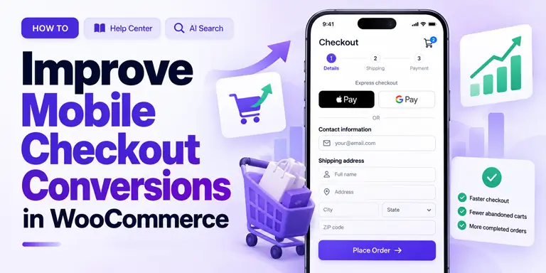
How to Improve Mobile Checkout Conversions in WooCommerce: 10 Best Practices

Quick Answer: To improve mobile checkout conversions in WooCommerce, offer express payments first, ask for email early, and use a single-column layout. Add a sticky button, enable address autofill, and place trust signals near payment fields. Then speed up the page and test on real phones.
Many WooCommerce stores get plenty of mobile visitors but still lose shoppers during checkout. When mobile traffic is healthy but checkout completion is weak, friction is a good place to start. Small problems add up on a small screen. A tiny field, a hidden button, or a slow page can be enough to interrupt the purchase.
If you want to improve mobile checkout conversions in WooCommerce, start with what shoppers touch most. That means payment options, form fields, trust cues, and speed. Each of these has a clear fix.
This guide gives you ten best practices to apply in order. Each one explains why it works, how to set it up, and who it suits best. You will also find a comparison table, a checklist, and answers to common questions.
Already using a Shopify-style layout? Our guide on how to add a Shopify-style checkout in WooCommerce covers the setup, so this article can stay focused on mobile results.
Key Takeaways
- Mobile shoppers type on small screens, so each extra field can cost an order.
- Baymard’s surveys show shoppers mainly leave because of extra costs, doubts about payment safety, and long checkouts.
- Speed matters. Google research has historically found that 53% of mobile visits may be abandoned when loading takes longer than three seconds.
- Start with the first three practices, then measure each change by device in GA4.
- Check every change on real phones before you move on.
Table of Contents
Why You Need to Improve Mobile Checkout Conversions in WooCommerce
Mobile now brings more than half of global web traffic. Yet carts are often abandoned before payment. Baymard Institute has pulled together dozens of studies on this. Its average cart abandonment rate is about 70%.
Baymard also asks shoppers why they leave. The top reason is extra costs such as shipping, tax, and fees. Its figure has ranged from 39% to 48%, depending on the survey year. Between 17% and 19% say they did not trust the site with their card details. Another 17% to 18% say the checkout was too long or complicated.
The good news is that most of these causes can be fixed. Fewer fields mean less typing. Less typing matters most on a phone.
How We Chose These Practices
Each practice below passes four tests. These tests keep the list practical.
- It fixes a mobile problem. It must solve a clear issue such as typing, trust, speed, or navigation.
- It works in WooCommerce. You can apply it with settings, a plugin, or a small code change. You do not need to rebuild your store.
- You can check it. You can test it on a real phone or measure it in your analytics.
- It has support. Where possible, it matches usability research or Google guidance.
Best Practices to Improve Mobile Conversions
# 1: Offer Express Payments First
Typing is the hardest part of mobile checkout. Express payments remove most of it. With Apple Pay or Google Pay, shoppers confirm with a fingerprint or face scan. They do not type a card number, billing address, or security code.
How to set it up:
- Turn on Apple Pay and Google Pay in a gateway that supports them, such as WooPayments or Stripe.
- Show the express buttons at the top of the checkout page, above the form.
- Use clear labels, such as “Pay with Apple Pay.”
- Follow your gateway’s guide closely, because Apple Pay usually needs extra verification steps.
Watch out: Express payments can skip your normal form. If you collect order notes or VAT numbers, plan a standard fallback for those orders.
Best for: Stores with many first-time mobile buyers.
# 2: Ask for Email Early
Your email field decides whether you can follow up. If a shopper leaves after typing an email, you can send a reminder. If they leave before, you cannot. This matters on mobile, where sessions are short and interruptions are common.
The classic WooCommerce checkout lists email near the end of the billing fields. The newer block checkout starts with contact details. Check which one your store uses before you change anything.
How to set it up:
- Move the email field to the top of the form. A field manager helps here. ShopLentor’s Checkout Field Manager (Pro) lists field reordering and custom validation among its features.
- Add a short line under the field, such as “We’ll send your order confirmation here.”
- Set up reminder emails. One common schedule is 1 hour, 24 hours, and 72 hours after the shopper leaves. ShopLentor’s Abandoned Cart module offers email campaigns, personalized coupons, and analytics for this.
- Check the privacy and consent rules in your region before you email people who did not finish an order.
Best for: Stores that already send marketing or recovery emails.
# 3: Use a Single-Column Layout
Two-column forms look tidy on a desktop. On a phone, they squeeze fields together. A single column gives each field its own full-width row. The eye then moves in one direction, from top to bottom.
How to set it up:
- Switch to one column on screens narrower than about 768px.
- Make fields and buttons comfortable to tap. Google’s guidance suggests touch targets of about 48px, spaced roughly 8px apart, to reduce accidental taps.
- Keep labels visible above each field. Do not rely on placeholder text alone, because it vanishes when the shopper types.
- Check the layout in portrait mode on a real phone.
Best for: Stores with older themes or custom checkout styling.
# 4: Add a Sticky “Continue” or “Place Order” Button
On long forms, the main button scrolls out of sight. Shoppers then hunt for it. Some give up. A sticky button stays at the bottom of the screen, so the next step is always within thumb reach.
How to set it up:
- Keep the main button fixed at the bottom of the screen on mobile.
- Use a high-contrast color so it stands out from the form.
- Match the label to the step, such as “Continue to Payment” or “Place Order.”
- Test with the keyboard open. The button must not cover the field being filled in.
Some themes and checkout plugins include this option. If yours does not, a developer can add a mobile sticky button. Test it carefully with checkout validation, payment methods, and the mobile keyboard. It must not block fields or interfere with the order flow.
Best for: Stores with long or multi-step checkout forms.
# 5: Enable Address Autofill and Smart Keyboards
Typing a full address on a phone is slow. It also invites mistakes. Two fixes help. Address suggestions let shoppers tap an address instead of typing it. Smart keyboards open the right keypad for each field.
ShopLentor’s Google Address Autocomplete module offers Google-powered address suggestions at checkout. Google’s address service may need an API key and can add costs, so check Google’s current pricing first.
The HTML inputmode attribute controls which keyboard opens. Many checkout plugins handle this already, but you should still confirm it on a real iPhone and Android phone.Field Type Expected Keyboard Phone number Phone or numeric keypad Postcode / ZIP code
Numeric keypad only where postcodes are numbers. UK and Canadian postcodes include letters.Card number Numeric keypad Email address Email keyboard (@ symbol visible by default) Name / Street address Standard QWERTY keyboard
Also remove any field you do not need to ship the order. ShopLentor’s Shopify Style Checkout module lets you show or hide the phone number and company name fields. Keep a field only if shipping, tax, payment, or the law requires it.
Best for: Stores that ship to many addresses, or that sell on phones to returning visitors.
# 6: Show Trust Signals Near Payment Fields
Shoppers hesitate most when they reach the payment step. That is where trust cues work best. Baymard’s surveys show that 17% to 19% of shoppers have left because they did not trust the site with their card details.
Screen space is tight on a phone, so place a few signals in the right spot instead of many in the wrong one.
What works well:
- A padlock icon next to the card fields, not only in the footer.
- Payment logos, such as Visa, Mastercard, and PayPal, in or just above the payment section.
- One short statement under the card field, such as “Secure checkout. Your payment details are encrypted.” Use it only if it is true for your store and gateway.
- One sentence about your return policy near the Place Order button.
What to avoid: Too many badges make a page look cluttered. Low-quality or generic badge images can look fake. Trust cues placed only in the footer are rarely seen on mobile.
ShopLentor’s Shopify Style Checkout module also lets you choose a menu for the bottom of the checkout page. You can use it for links to your return policy, shipping details, and contact page.
Best for: Newer stores and stores selling higher-priced items.
# 7: Show a Collapsible Order Summary
A single-column checkout pushes the order summary out of view. Shoppers then cannot see what they are buying. Doubt creeps in, and some open another tab to check the product. Many never come back.
How to set it up:
- Place a collapsed summary at the top of the checkout page on mobile.
- In the collapsed state, show the item count and the order total.
- Let shoppers tap to expand the full list, including shipping, tax, and discounts.
- Make sure opening or closing the summary never clears what they typed.
If you build a custom checkout with ShopLentor Pro, its Checkout Order Review widget shows products, quantities, and pricing on the page.
Best for: Stores where shoppers often double-check what is in the cart.
# 8: Speed Up Your Checkout Page
Slow pages lose shoppers before they see the form. Google research found that 53% of mobile visits are abandoned when a page takes longer than three seconds to load. That study looked at mobile sites in general, not only checkouts, and it dates from 2016. Even so, the lesson still holds: speed on a phone matters.
Your checkout can be slower than the rest of your site. Payment scripts, tracking pixels, and extra plugins all add weight. A fast homepage does not guarantee a fast checkout.
How to check your speed:
- Add a product to your cart first. An empty cart usually redirects the checkout URL to the cart page.
- Open Google PageSpeed Insights and paste your checkout URL.
- Choose the mobile results, not desktop.
- Look at Largest Contentful Paint (LCP). Google treats 2.5 seconds or less as good.
- Read the suggestions to see which scripts slow the page.
How to improve it:
- Delay scripts that are not needed at the start, such as live chat and analytics.
- Load plugins only where they are needed. HasThemes’ WP Plugin Manager lets you disable selected plugins on specific pages, posts, or custom post types. Use it to stop plugins that checkout does not need from loading there, and test your checkout after every change.
- Use small, compressed images in the order summary.
- Audit payment and third-party scripts to find unnecessary checkout overhead. Do not delay or disable scripts needed for payment processing, checkout validation, or fraud prevention.
Best for: Stores with many active plugins or several third-party scripts.
# 9: Let Shoppers Edit the Cart at Checkout
Shoppers often spot a wrong size, color, or quantity once they reach checkout. In many stores, fixing it means going back to the cart page. On a phone, that extra trip can end the session.
How to set it up:
- Add a mini cart at the top of checkout with the product image, name, variant, and quantity.
- Let shoppers raise, lower, or remove items without leaving the page.
- Update the totals right away, without a full page reload where possible.
- Decide what happens if they remove the last item. Show a clear message and a link back to the shop, not a blank page.
Check your checkout plugin or builder for this option. Test it carefully on a phone, because it changes totals and shipping.
Best for: Stores that sell variable products, such as clothing.
# 10: Test on Real Phones
Browser tools show how a page fits a screen. They do not show how it feels in your hand. Real devices catch problems that emulators miss.
Common problems found on real phones:
- The keyboard pushes the sticky button off the screen.
- Fields look fine but are hard to tap on a compact phone.
- Express payment buttons fail to show on some browsers or system versions.
- Error messages appear in odd places.
- Address suggestions overlap other fields.
A simple test plan:
- Use at least two iPhones and two Android phones, in different screen sizes.
- Complete a full order on each one in your gateway’s test mode. Then place one small live order to confirm the final flow.
- Test Apple Pay and Google Pay separately, because they follow a different flow.
- Ask someone who does not work on your site to buy something without help. Watch where they hesitate.
Best for: Every store. Run it again after each theme, plugin, or gateway update.
Comparison Table: All 10 Practices at a Glance
The effort column is a rough guide. Your theme, plugins, and gateway will change it.Practice Problem it fixes Typical effort Best for 1. Express payments Typing card and address details Low to medium First-time mobile buyers 2. Email first Lost follow-up chances Low Stores sending recovery emails 3. Single column Cramped fields Low to medium Older themes 4. Sticky button Hunting for the next step Low Long forms 5. Autofill and keyboards Slow, error-prone typing Medium Stores with many addresses 6. Trust signals Doubt at the payment step Low New or high-priced stores 7. Order summary Losing sight of the cart Medium Stores with multi-item carts 8. Page speed Slow loads Medium to high Plugin-heavy stores 9. Cart edits Trips back to the cart Medium Variable products 10. Real-phone tests Problems no emulator shows Low Every store
ShopLentor- WooCommerce Builder for Elementor & Gutenberg
A versatile page builder to build modern and excellent online stores with more than 100k+ Active Installations.
Where ShopLentor Can Help?
ShopLentor is made by HasThemes, the publisher of this blog. The table below lists only what its own product pages state. Express wallets such as Apple Pay come from your payment gateway, not from these modules.Need ShopLentor option What the product page states Fewer fields and clean branding Shopify Style Checkout module A 3-step flow, logo upload, a bottom menu, show or hide phone and company fields, hide cart navigation, and custom labels Address suggestions Google Address Autocomplete module Google-powered address suggestions at checkout Cart recovery emails Abandoned Cart module Email campaigns, personalized coupons, and analytics Field order and rules Checkout Field Manager (Pro) Add or remove fields, custom validation, and field reordering Custom checkout layout Checkout widgets (Pro) Widgets for billing, shipping, payment, coupon, and order review sections
Common Mistakes to Avoid
- Hiding express buttons below the form. Shoppers who want a fast checkout may never see them.
- Testing only in a browser emulator. It misses keyboard, touch, and wallet problems.
- Showing shipping and tax late. Extra costs are the top reason Baymard’s respondents give for leaving.
- Adding too many badges. A cluttered payment section looks less safe, not more.
- Testing speed on the homepage. Your checkout URL can behave very differently.
- Removing a field you need. Keep any field required for shipping, tax, payment, or legal reasons.
How to Prioritize Your Changes
You do not need to do all ten at once. A sensible order is below. Results vary by store, so measure each change before you move on.
- First: express payments, email placement, and a single-column layout.
- Second: the sticky button, autofill, and fewer fields.
- Third: trust signals, the order summary, and cart edits.
- Always: speed checks and real-phone tests after every change.
Mobile Checkout Checklist
Use this list before you publish changes and after any site update.
Layout and Design
- Single-column layout checked on a real phone in portrait mode
- Email is the first field, or contact details come first
- Sticky button stays visible, even with the keyboard open
- Order summary is easy to open and close
Payments and Speed
- Apple Pay and Google Pay are on and shown above the form
- Checkout loads fast on mobile, with LCP at or under 2.5 seconds
- Non-essential scripts are delayed or removed
- Unneeded plugins do not load on the checkout page
Trust
- Padlock or secure-payment note sits near the card fields
- Payment logos appear in the payment section
- A one-line return policy sits near the Place Order button
Forms
- Address suggestions work on real iOS and Android phones
- Number fields open the right keyboard
- Only needed fields remain
- Shoppers can change quantities at checkout
Testing
- Full test order done on at least two iPhones and two Android phones
- Express payments tested separately
- Reminder emails confirmed working
- One person outside your team has tried to buy without help
Frequently Asked Questions
Why is mobile cart abandonment higher than desktop?
Industry reports usually show higher abandonment on mobile. The causes are practical. Tap targets are small. Typing is slow. Pages load more slowly on weaker connections. Shoppers are also more likely to be interrupted mid-session.
Do Apple Pay and Google Pay improve mobile conversions?
They often can, because they remove the most typing. The size of the gain depends on your audience, your device mix, and your gateway. Turn them on, then compare mobile conversion before and after in your own analytics.
How many form fields should a mobile checkout have?
Keep as few as possible while still collecting what you need to ship and bill the order. Baymard found that most checkouts could show 20% to 60% fewer form elements. For many stores, that means dropping the company name, hiding the second address line by default, and questioning every optional field.
What is the difference between a responsive and a mobile-optimized checkout?
A responsive checkout resizes to fit any screen. That is the minimum. A mobile-optimized checkout goes further. It uses thumb-friendly buttons, the right keyboards, express payments, and a clear order summary. Responsive design stops the layout from breaking. Mobile optimization helps it convert.
Can I improve mobile checkout without rebuilding my store?
Yes. Most practices here are settings, plugin options, or small style changes. Express wallets come from your payment gateway. Address suggestions, field changes, and recovery emails come from plugins. You can make these changes one at a time.
How do I know if my checkout is losing mobile sales?
Use Google Analytics 4. Open Explore, then Funnel exploration. Add the steps begin_checkout and purchase. Break the results down by device category. Compare the drop-off on mobile with desktop. If mobile loses far more shoppers, your mobile checkout needs attention.
Conclusion
A Shopify-style checkout gives your WooCommerce store the right structural foundation for mobile. The real conversion gains come from the details that sit on top of that foundation — where the email field sits, whether express payments are one tap away, how quickly the page loads, and whether shoppers feel confident entering their payment details.
Each best practice in this guide targets a specific friction point that causes mobile shoppers to abandon before completing their purchase.
Start with express payments and the sticky CTA button — those two changes typically produce the most immediate, measurable impact. Then work through the rest of the checklist systematically, testing on real devices at each stage.
Useful next steps:
- How to Optimize Your WooCommerce Product Pages: product page optimization
- How to Add a Shopify-Style Checkout in WooCommerce: the setup guide
- How to Create a Multistep Checkout for WooCommerce: another checkout flow to consider
- How to Reduce Cart Abandonment in WooCommerce: recovery ideas beyond checkout